Search ResultsFor "disney model"
Disney 06 May 2009 07:40 am
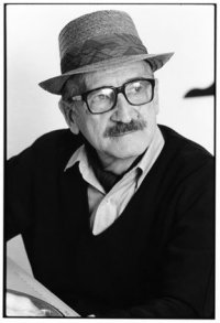
Art Babbitt & Jack Kinney
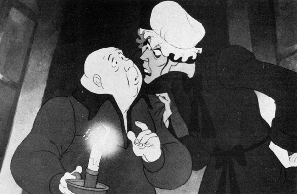
I received another delightful note from Borge Ring. It concerns Art Babbit and Jack Kinney:
- Jack Kinney as a strategist
You mention Art Babbitt in your comment on Mike Barrier’s keen review of the Milt Kahl Celebration. Here is a Babbitt experience you may not have heard about.
Art was inducted into the Marines during the Second World War.
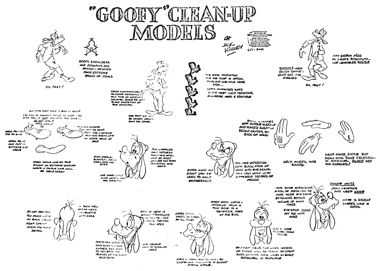
 During his absence Disney had developed a brand new Goofy series written and directed by Jack Kinney and his brother Dick. These funny films starting with “How to Ride a Horse.” The CHAPLINESQUE animation was done by the much maligned Woolie Reitherman and the brilliant John Sibley. The familiar character of Goofy was drastically changed, His actionline was reversed to point up an optimistic chest instead of the hunched shoulders
Jack Kinney wrote:
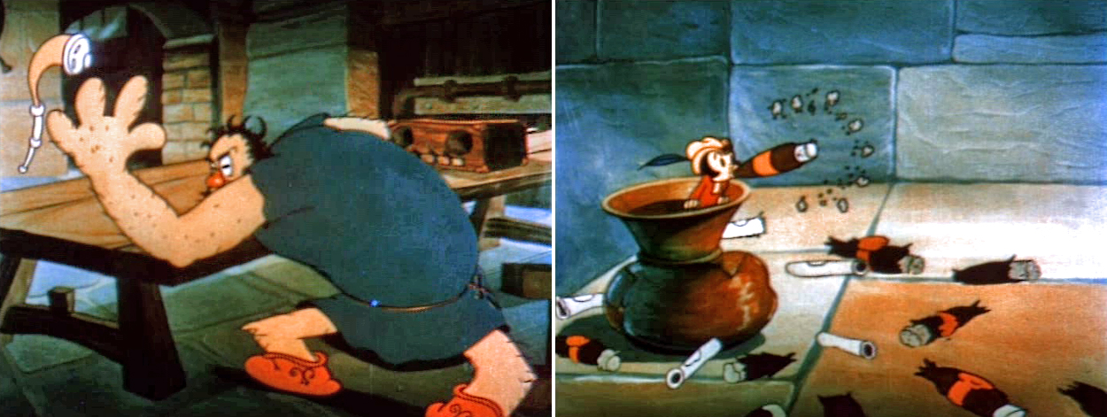
”Art had won the courtcase with Disney. He came back to the studio and was assigned to work on my new Goofys. He demanded [a Goofy with] shoulders and five fingers, because otherwise he could not use the live action he always shot of Pinto Colvig, I gave him a whole Goofy to do as his very own “The Baggage Buster” That would keep him peaceful for awhile. And in the meantime I could make two, three or four Goofys without having him fuck them up”
writes
Børge
After a slightly strange “Baggage Buster” Jack Kinney (or whoever) relented and Babbitt animated some excellent “oldfashioned” Goofy sequences in the new series such as “Goofy’s Glider.”
Babbitt was a top “oarsman” onboard the good ship Hyperion and developed way up into Rooty Toot Toot. Art and Tissa David were John Hubley’s favourite animators. Hubley used to phone him from NY and beg: ‘”Thirty feet, Art. Juat thirty feet. ..please”
Copy of a copy of a copy.
(Click any image to enlarge.)
In 2006, I wrote about Art Babbitt’s work with Hubley on the Carousel feature here.
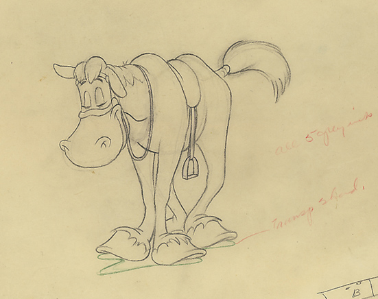
The beautiful horse, from How To Ride A Horse, comes from Jenny Lerew’s collection.
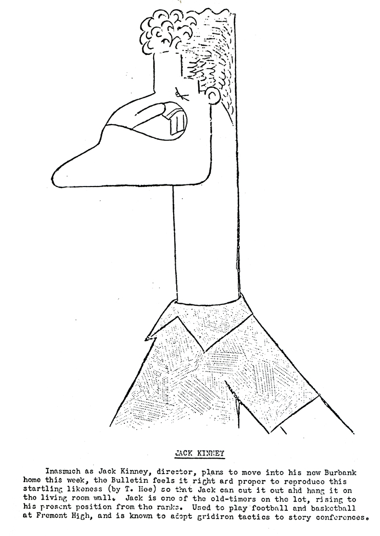
The Jack Kinney drawing is from the Disney Bulletin.
Animation Artifacts &Commentary &Hubley 24 Apr 2009 07:37 am
Up Up and Away
 – Yesterday’s NYTimes blog, The Carpetbagger, featured a short piece on the expansion at Pixar. The source of the Times’ information was the Pixar Blog which admits to the construction. The cost of construction, “does not include labour and other associated costs, which will undoubtedly run into the millions of dollars also.”
They then go on to add that the rest of the Disney studio is laying off workers, while they, Pixar, are expanding.
Très generous.
The Times comments: “But it’s hard to argue that Pixar is being in any way excessive with these plans. The studio, acquired by Disney in 2006 for $7.4 billion, has been planning the expansion for years, and desperately needs it: its current space, while opulent by some standards, is crammed far beyond its designed capacity.”
 – Mark Osborne, one of the co-directors of Kung Fu Panda, reminisces on AWN about classes with Jules Engel at CalArts. This is a heartfelt piece that I enjoyed reading. If you haven’t found it yet, you might take a glance. The piece was written to coincide with the celebration of Jules’ work which was held last Sunday; fortunately the words live past that date.
I like the fact that there are groups keeping Jules’ name alive. Aside from the positive comments from past students, there is also the Jules Engel Appreciation Group on Facebook. I wish some of the other important figures in animation’s history had equal attention. Maybe that’s part of my reason for writing on this blog.
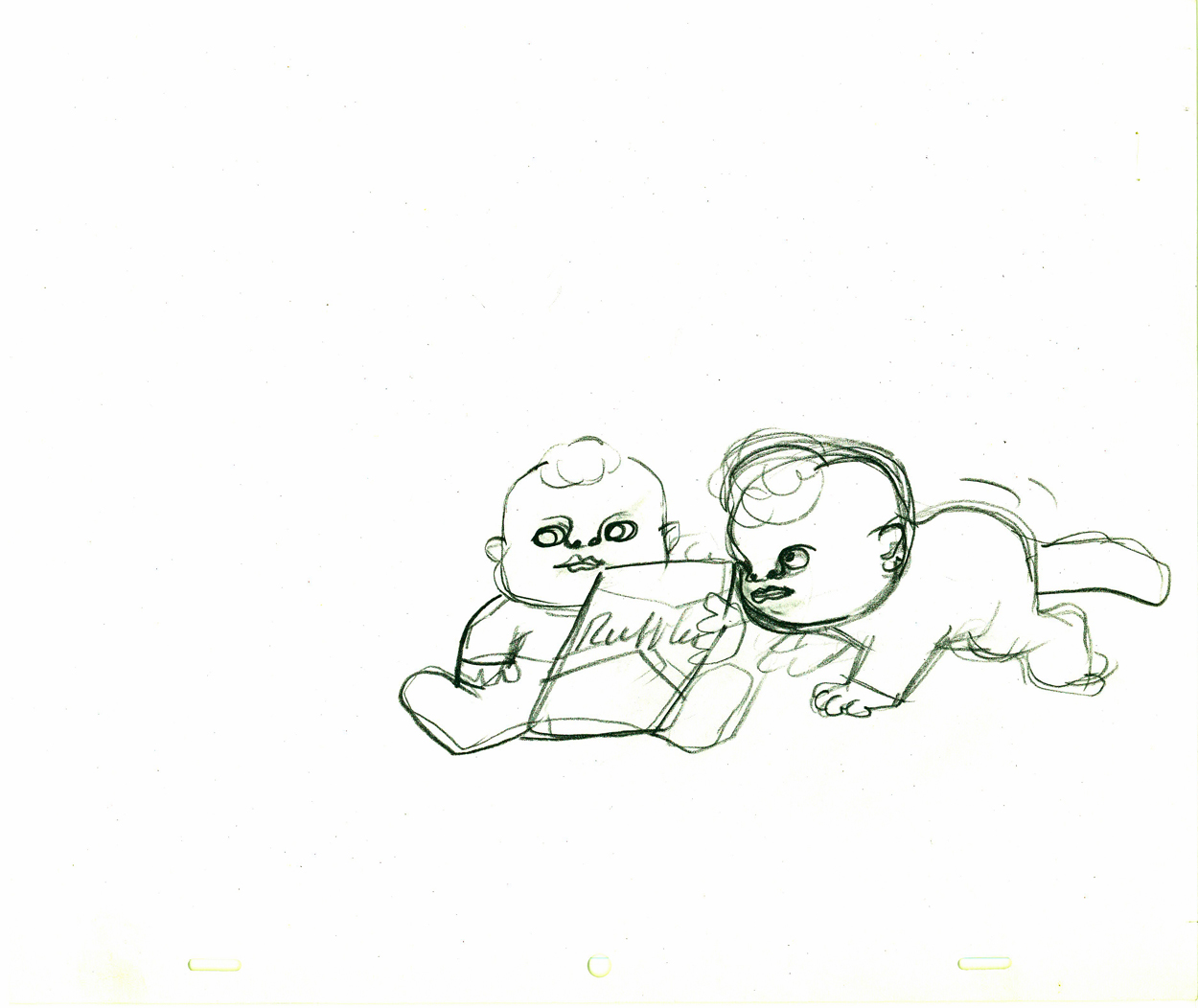
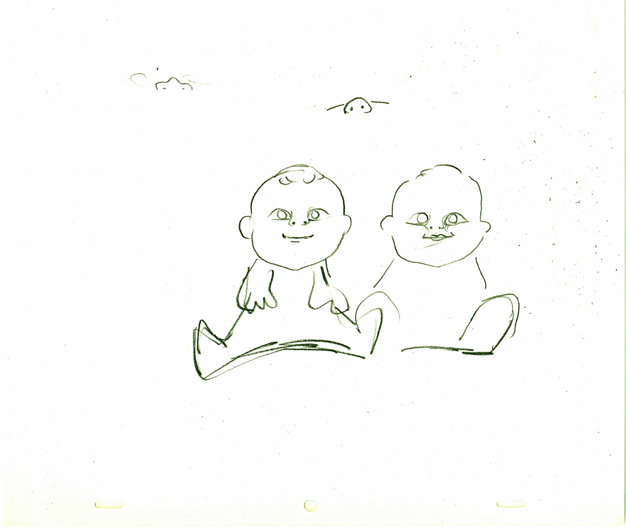
- To that end, let me share these four drawings by John Hubley of a baby for a Ruffles commercial. I haven’t seen the spot, done in the late 60s, but I have seen lots of toddlers drawn by Hubley. It’s amazing how different all of them are. Each child has a real personality and charm that I find extraordinary. How many kids have we seen in the past twenty or so years in Disney/Dreamworks/Pixar/Bluth features that are all so identical. Their feature films like to post the names of all the production babies at the end of their films, but I’m not sure any of the animators actually see their babies, at least based on the characters we’ve seenanimated. (Think of that cloying cliché of a toddler in the otherwise excellent short, One Man Band.)
I haven’t found two such tykes from Hubley’s hand that resemble each other – or other cartoon children.
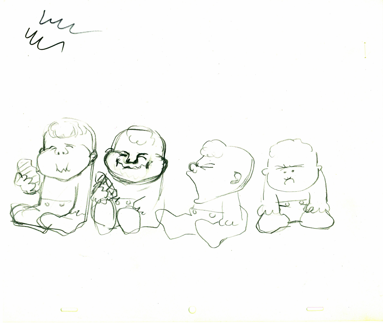
(Click any image to see the full animation drawing page.)
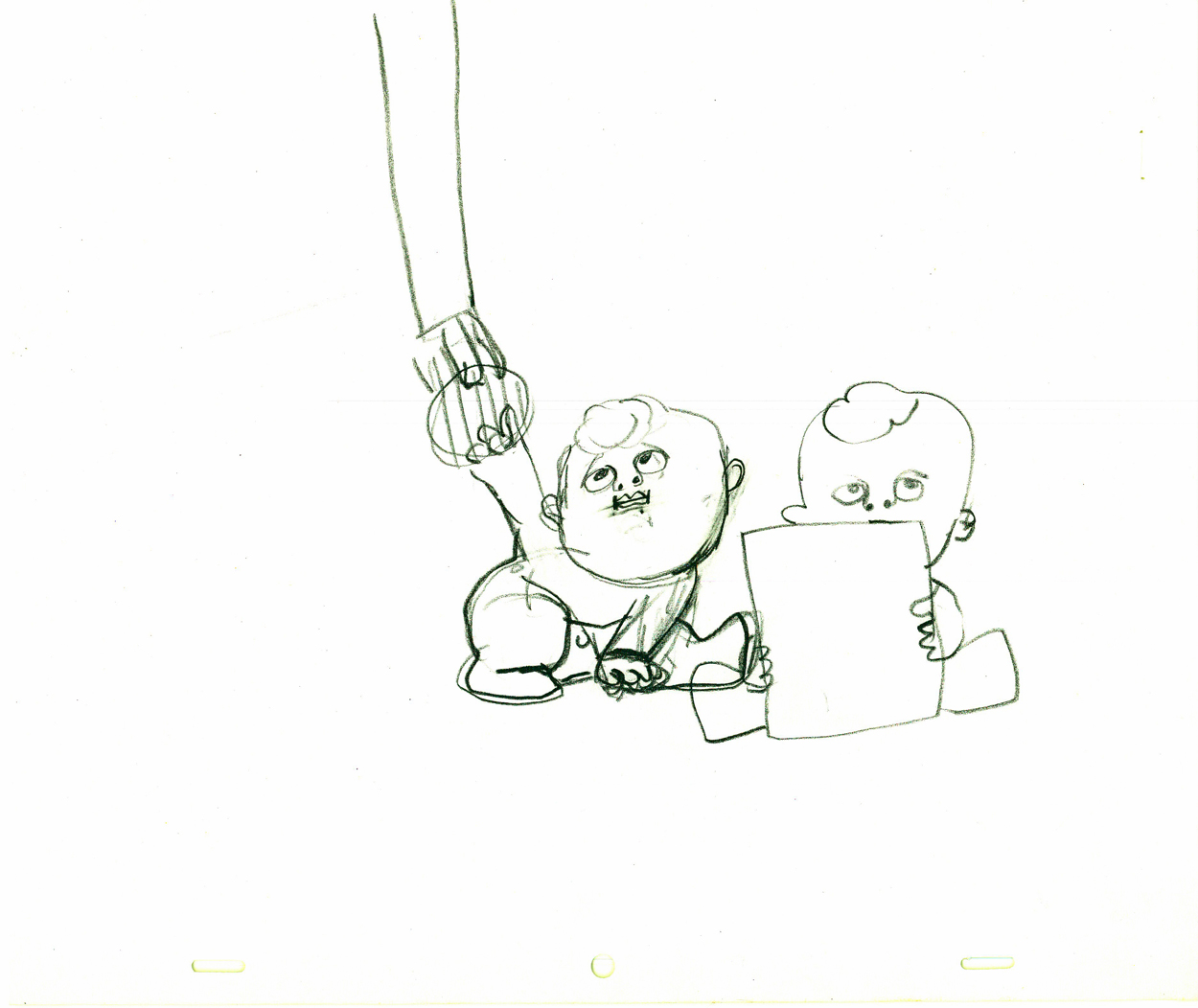
A decent animator can’t help but know what to do with such models.
Daily post 18 Apr 2009 08:46 am
Bits & Pieces
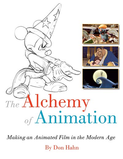 - Michael Barrier has an interesting piece on his site reviewing two Disney books: Amid Amidi’s The Art of Pixar Shorts and Don Hahn’s The Alchemy of Animation. I certainly agree with what Mike has to say. I’d already commented on Amid’s attractive book on this site back in February; as a matter of fact, I actually wrote about all of Amid’s books. I haven’t seen Don Hahn’s new book yet, but, if it’s like his last book, my general feeling was that I wish he’d dig a little deeper. He has a lot to say and he has the ability to write. I’d really like to see him write about the job of producing a Disney animated feature. He’s in a select club, and it’d be interesting to hear his heartfelt comments. Maybe someday.
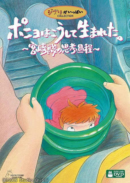 - Ponyo on the Cliff, as you may already know, is going to be released theatrically by Disney in an English language version on Aug. However, if you’re as manic about Miyazaki’s work as I am, you may want to send, in advance, for the Japanese dvd which will be released in July. It includes English subtitles. That edition is available for pre-order now at Amazon.jp.
There will be two versions of this DVD. There is a basic edition and there is a nine disc set that includes the film, a twelve-hour five-disc making of documentary, and a two disc live performance from Miyazaki’s regular composer Joe Hisaishi. That peculiar documentary is also available on its own, in case you want to wait for the American version of the film and just want this extra. It would appear to me that the extras do not have English subtitles.
To keep up with news of this material, you might want to be watching Daniel Thomas MacInnes‘ excellent site, Ghibli Blog. It was recently remodelled and has an attractive new format. You’ll find 6 excellent clips from this Miyazaki film on this site. (Go here and scroll down a bit.)
- Here’s another site that I’m sure you are all aware of, but it doesn’t hurt to keep mentioning it. The National Film Board of Canada has on their site quite a few of their classic films for viewing, for free. If you’re not aware of these films or haven’t seen them, then got there and look. There are some absolute classic gems there in good editions.
Make sure you at least see the following shorts:
 Start with these two Caroline Leaf shorts:
The Street
Two Sisters
Then go at random to any of these:
The Sweater – Sheldon Cohen
The Big Snit – Richard Condie
Cat’s Cradle – Paul Driessen
The Great Toy Robbery – Jeff Hale
The Romance of Transportation in Canada – Colin Low
The Tender Tale of Cinderella Penguin - Janet Perlman__________________________Caroline Leaf’s brilliant film The Street
Walking – Ryan Larkin
When the Day Breaks – Wendy Tilby Amanda Forbis
Christmas Cracker – Norman McLaren, Gerald Potterton, Grant Munro, Jeff Hale
 and, it goes without saying that you should know by heart the following Norman McLaren shorts:
Begone Dull Care
A Chairy Tale
La Merle
Hen Hop
Now, if I can make a request of the NFB: please add the Hubley short, The Cruise, to this list. It’s rarely seen and an important film in the canon of Hubley’s work.
Hubley’s The Cruise
- In case you’ve missed all the press releases, Fox has a new show premiering on Sunday evening at 8:30 PM Eastern. Sit Down Shut Up comes from the mind of Mitchell Hurwitz. He was the creator of Arrested Development, a writer on The Ellen Show and The Golden Girls. His writing compatriots come from the staff of Two and A Half Men. The voice cast is filled with a lot of talented comedians.
A lotta heavy-duty TV credentials.
There’s a NYTimes article in Friday’s paper which includes a confusing clip. And here’s another article in Saturday’s paper.
The NYDaily News review is headlined: From the Grossout School of Comedy and gives it three stars.
Variety‘s review includes the line: “Seemingly preoccupied with impressing teenage boys, the show should possess scant appeal outside that demo.”
Hmmm.
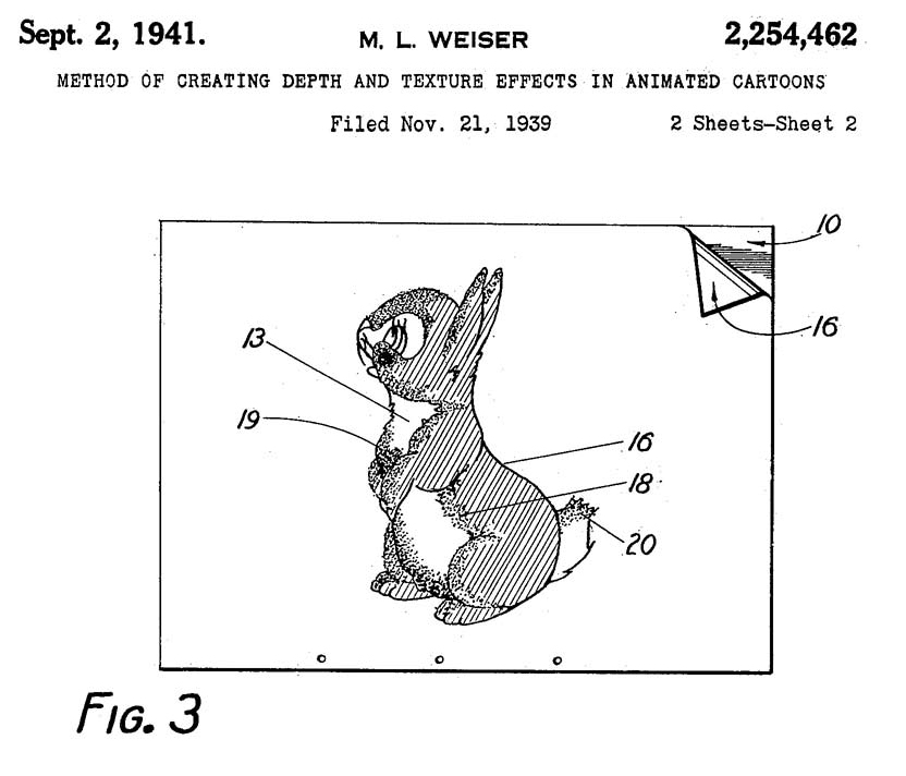 - Far and away, one of the most consistently excellent and important animation sites out there is Hans Perk‘s extraordinary AFilmLa. The documents Hans posts regularly are just incredible. Where does he find them?
Currently he’s running a patent filing for “The Blend“. Mary Louise Weiser, head of the Ink and Paint Department at the Walt Disney Studios in 1939, registered two patents for inventions she claimed for the Disney studio.
.
Hans posts all of the patent documents and a brilliant photo of Mary Louise Weiser.
By the way, I also note that the comments on Hans’ site are always so few. It’s impossible to believe that so few have anything to say about the material that’s found there!
Animation &Hubley 15 Apr 2009 07:44 am
Hub Eyes
 - It was 1973, and I was happily – I can’t tell you how happily – ensconced in the Hubley studio working on Letterman, a new series for an upcoming CTW show, The Electric Company.
It was my first animation job. I inked it all (directly from animator roughs), I assisted & inbetweened it all, and I animated odd scenes including all the title sequences. I was a novice, and I was doing it all. Excited and happy is all I can remember.
I was alone one morning in the small room wherein I worked. I made a habit of getting into work before anyone and leaving after everyone. I wanted to make sure I was indispensible.
 A month into the gig, and I think I’d only spoken with my hero, John, about a half dozen times. I was rushing through one of the Johnny Gent “Spellbinder” sequences. I inked all of his scenes, then inbetweened in ink the drawings. No time to work in pencil for this schedule. Johnny was completely off character, in a very old fashioned way, and I had to rework them all closer to the models – in ink. The schedule just gave me no time to be proud of what was happening. (A year or so later I apologized to Johnny for what I did to his artwork. I was so inexperienced and had such a dominant role in how the final art looked in that series.)
John Hubley ran in to give me something and made a quick comment about the character I’d been drawing. He said it was a “Paramount eye.” I looked at the drawing, then at him. Then John drew on a small piece of paper a “Disney eye,” then a “Terrytoon eye.” He laughed aloud and told me to try to square off the eyes a bit. Then he ran out.
 I learned a lot that day. I watched eyes that day and probably all that week. I ran Hubley films at lunchtime (I’d made it a habit to project their films in the kitchen during many of the lunch breaks. The entire group enjoyed these sessions) and watched the eyes. I talked with Tissa David about eyes in one of our evening tutorials – she was trying to teach me how to inbetween properly.
I was reminded of this moment when Chuck Rekow commented on the Moonbird Walk posted weeks ago. “The shape of the eyes on the boys is a real departure from almost anything in the cartoon world —even 50′s era. It’s closer to real life, and reminds me of the graphic style of Ben Shahn. It lends the film an aura of “seriousness”, even though it’s a cute film about two boys and an imaginary bird. Obviously, the pre-recorded sound is a major deal, but this gem is loaded with touches of inventive detail.”
How right he is, and I love being reminded of it.
 The eyes are the direct route to the soul of a person and, consequently, an animated character as well.
After working for the Hubley studio, for a short bit, I worked for Phil Kimmelman and Associates. This was a hardy commercial studio doing tight designer-based animation. Rowland Wilson was doing a lot of their design work, and the animation clean-up was tight. Animators Jack Schnerk, Sal Faillace and Dante Barbetta did a lot of the work the few months I was there. I worked primarily as an inbetweener and learned some hard and tight lessons while there.
 After the very loose work I’d been doing for the Hubley films, it was not only difficult for me, but good to keep me towing the proper line. I wanted to learn animation, and all of it was important.
Here, too, an empahsis was on the eyes. No Disney eyes, no Hubley eyes, either. But now I was just concerned with keeping those lines tight tight tight. No shimmer on the eyeballs. After all, I was told, people stared into the characters’ eyes, and any flaws in the animation would show up first in those eyes.
I worked for PK&A for about three or four months. I’d also worked for Tubby the Tuba at NYInstitute of Technology under Johnny Gentilella, where we got somewhat close and I was able to discuss all sorts of animation problems with him. That was the only redeeming element, everything else about the studio was wretched. My displeasure ultimately led to my leaving as soon as I could.
Eventually, I was back at the Hubley studio helping to finish up the short Cockaboody.
The tightening of my inbetweening only brought positives to what I could now do for John Hubley’s animation.
To this day, I still watch eyes closely. For some reason, the tighter the lnework, the closer I watch the assistant’s work. The looser the line, the more I watch the design. I prefer watching the design. Often it means eyes that can be easily labelled: Disney, Paramount, or Terrytoons. I suppose today, you’d say: Pixar, Dreamworks or Blue Sky. (And believe me, you can see those differences even in cg.)
The images above are from the following films:
Books &Disney &Mary Blair 14 Apr 2009 08:16 am
Chouinard the Book
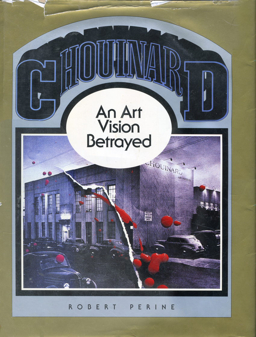 - I recently came upon an excellent book, Chouinard/An Art Vision Betrayed by Robert Perine published in 1986. This book is the history of the school that would become CalArts.
I suspect it’s more familiar to those on the West Coast than we on the other side of the continent. Regardless, the book well documents the connection between this art school and the Disney studio, particularly in the early days.
Here we’re treated to a good history of Don Graham, who led the Disney classes for Walt during the ’30s expansion movement. We also come upon students and teachers including all the famous names: Phil Dike, Virgil Partch, Hardie Gramatky, Retta Scott, Mary and Lee Blair, Ward Kimball and many others. We’re also treated to photos and artwork by these people. We also see a clear picture of the school’s founder, Nelbert Chouinard.
I’ve pulled a couple of photos and art pieces and a couple of paragraphs from the first chapter which I thought worth sharing.
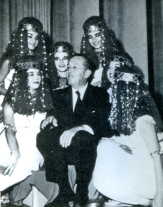 I made a deal with some of the teachers at Choulnard to come out and work with me, to sit with me by the day and know my problems. That, In turn, gave them the chance to know what we had to work on. They sat tight In the room with me; I picked Graham because he was more Life . . . figures and movement and things . . . simplification. So Graham sat with me In what we called our sweatbox. Fifty percent of my time was spent In the sweatbox going over every scene with every animator.
The sweatbox was an un-insulated projection room which Walt describes as “hot as the dickens,” where animators would come to sweat out Walts approval of their latest attempts. ‘They used to dread comin’ in… I’d just tear hell out of’em,” but this was all part of the learning process as both animators and studio head ____________Walt at Egyptian Ball – 1956
worked out the best solutions for making the
moving figure work. So Graham was soon a part of this process and carried Walt’s ideas back to his classroom.
Reciprocally, a bit of Graham (and Nelbert) rubbed off onto Walt as they worked together 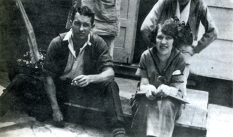 on the problems of animation. Said Walt:
I set up a whole new thing (which Is) having Us effect now among the artists. We think of action. We think of drawing for action. We call It action analysis. You draw from a static figure when you’re In Life class. And your model’s sitting there. You’re draiumg the spinal column … the whole anatomy… _______Don Graham on the porch of the 8th St. School
but you don’t get any feeling of action.
So we have the model go through actions. She goes through It and then.. .sits over In the corner.. .and they sketch what they saw. What you see here (Is) not a literal copy of something. It’s.. .the Illusion you get.
Even before Walt had come to California — when he was only 19 — he had frugally photostated Muybridge’s now-famous movement photographs out of a borrowed library book, then cut them up and overlapped them in an attempt to analyze motion. But now it was a new kind of challenge — doing it with drawing. Walt further describes that challenge:
We’ve got to analyze the walk. So we would then photograph people going through actions… then we would study It. There were a lot of things I was able to get over that way. You’d have a running action. We’d draw. (It’d) be perfect because (we’d) be looking at that drawing Individually on the drawing board. (But) It doesn’t look that way; that’s what gave us stiff animation. Then we got the trick of blurting.. .In effect, elongating. When you’re moving fast Is when the action begins to take on a smoothness.. At wasn’t numbers of drawings. It’s how drawings are made.
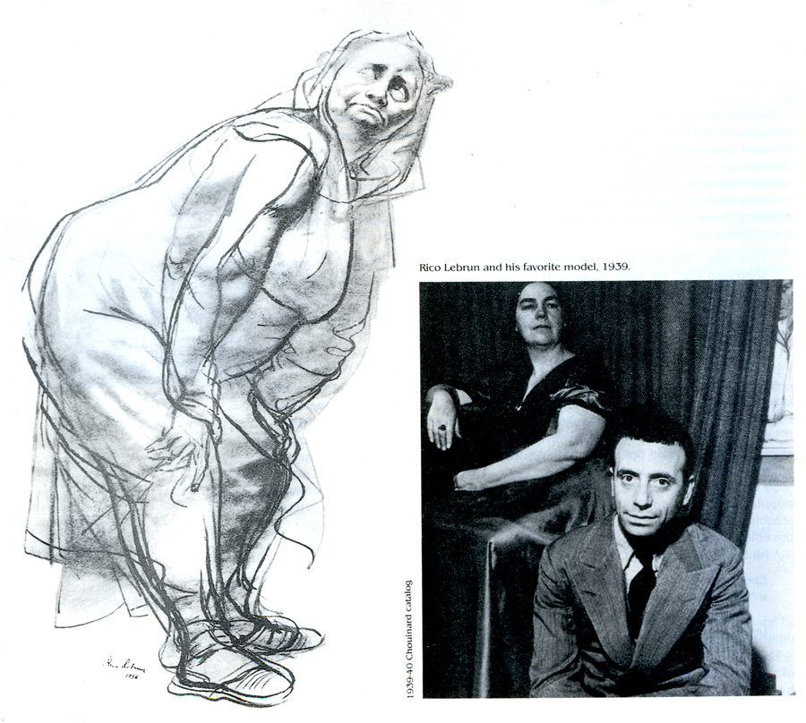
Rico LeBrun (who taught animal anatomy to the animators
at Disney during the making of Bambi) and his favorite model
-
The ideas that developed during Disney’s training period (1930-1940) were greatly aided by Don Graham. Eventually Walt hired him at Disney Studios as head of their own night school. So Nelbert’s influence and ideas were carried out into the professional world. In the animation industry alone Chouinard students and teachers like Graham, Dike, Caldwell, Davis, Gramatky, Fleury, Johnstone, Lebrun, Lee and Mary Blair, T. Hee, Plummer, and many others became important stimuli to the successful growth of the animated film.
A drawing by Retta Scott | Virgil Partch at a Guild Meeting
The book is a treat. I’ll add more to this in a future post.
Articles on Animation &Books 04 Mar 2009 08:36 am
Tekenfilm
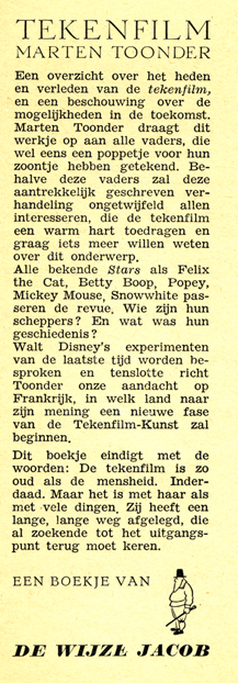 - Marten Toonder lived through much of the history of Dutch animation. (Like many other throughout Europe he gained the moniker of the “Walt Disney of Holland.”)
He was born in 1912 and died July, 2005. In 1940, with puppet animator, Joop Geesink, he formed the Geesink-Toonder Studio. The break-up of the two led to his forming the Toonder Studio in 1942.
He left this studio, as tituilar head, to get back to illustration in 1965, and ultimately retired in 1977.
Toonder is probably best remembered for his several successful comic strips. You can visit a sample of these here or here.
He made animated shorts of his comic strip, Tom Puss, which you can see on YouTube.
I make Toonder the subject of this post because I have an early book about animation which he wrote. Called Tekenfilm, it seems to have been written in 1946; at least that’s the only date I can find in the smallish publication.
It’s in Dutch, so I’m not able to read the book. However, I thought I’d post a couple of pages of the book . I haven’t been able to find any reference to the publication to date. ___________________The book’s flyleaf – in Dutch
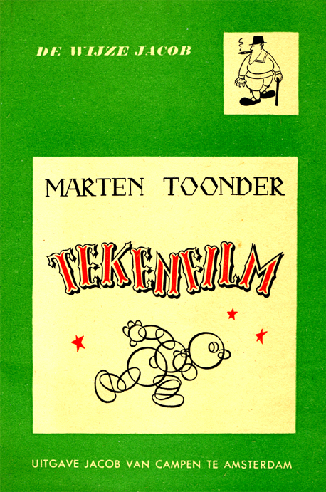
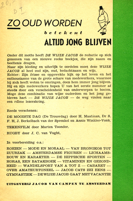
The book’s Front cover & Back cover
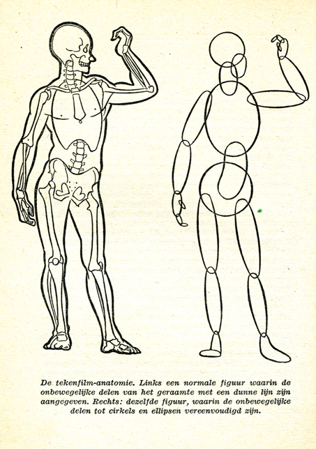
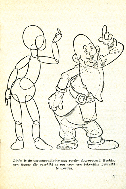
(Click any image to enlarge.)
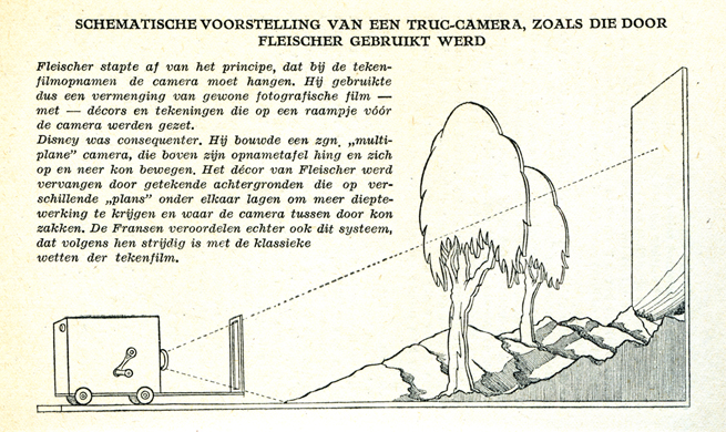
Here the Fleischer studio gets credit for the Multiplane Camera.
Felix develops.
I like the way Popeye is drawn. Koko looks more on model.

A wierd looking Oswald leads to Mickeys.
How to try to draw some characters.
Where’s Bugs?
Some basics
Pay attention to those arcs.
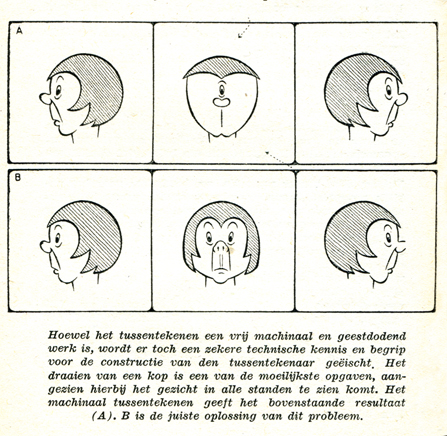
Here’s a lesson you still don’t see in many animation books.
How not to draw the mechanical inbetween.
His solution isn’t the best.
Ending with two European cartoons of merit from 1944:
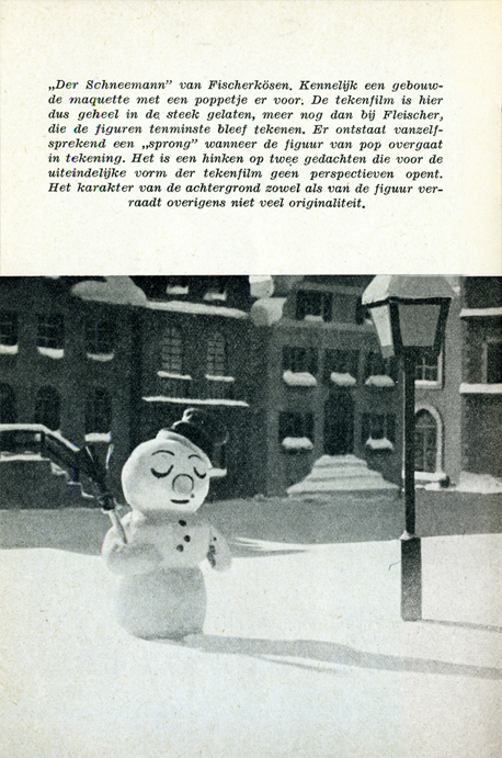
The Snowman in July by Hans Fischer-Kösen
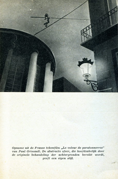
and Voleur de Paratonnerres by Paul Grimault
Articles on Animation 13 Feb 2009 08:50 am
Heidi’s Song
- Animated features, like some of the shorts, come and go. While working on it, there’s often an expectation that THIS will be the film to catch gold and change history. It doesn’t happen often.
Looking back on a puff piece from some past feature is oftentimes ludicrous; sometimes it’s just sad. Here’s a 1981 story from Millimeter Magazine about Hanna Barbera’s upcoming feature, Heidi’s Song. It sounds like it may be the future, but really it’s even hard to remember the film. It certainly didn’t change the world.
Will HEIDI’S SONG be its SNOW WHITE?
by John Canemaker
Hanna-Barbera Productions Inc. is such a giant corporate entertainment entity that it prompts the old joke: What does a two-ton canary sing? Any damn thing it wants! This Hollywood “canary” tias expanded since 1957 to become the wold’s largest producer of animated TV series andspecials; more recently Hanna-Barbera has become involved in themed amusement parks and live action movies for television.
Now H-B is eager to enter and conquer the sacred Disney domain of fully animated, “quality” feature-length animated films for theatrical release. William Hanna and Joseph R. Barbera hope to do so with an expensive flourish this summer when they will premiere HEIDI’S SONG, a $9 million cartoon feature that has been in production for five years. The film’s staff of 200-plus includes 12 background painters, 60 assistant animators, eight layout people, and 18 top character animators. All cut their teeth years ago at the Disney studio, or at MGM, working with Hanna and Barbera during their halcyon days in the 1940s and ’50s producing Tom and jerry shorts and animated segments for live action features such as Jerry the Mouse dancing with Gene Kelly in ANCHORS AWEIGH.
A moment of menace for Heidi whose voice is dubbed in by
Broadway actress Margery Gray in the Hanna-Barbera feature.
Joseph Barbera claims HEIDI’S SONG will be “a step forward in animation that’s very exciting.” But perhaps it will actually be a welcome artistic step back—a comeback of sorts—for Hanna and Barbera, who were once considered by their peers and the public to be superior cartoon craftsmen, winners of seven Academy Awards for two decades of beautifully timed and fully animated Tom and Jerry cartoons. In the 23 years since forming their own company—a factory geared to the production of “limited” animation series, a reduced form of animation that, as an H-B publicity release points out, “ignored the time-consuming and expensive detail that would not be visible on the dimly lit video screen”—Hanna and Barbera have produced over 20 TV specials and some 60 series (“Huckleberry Hound,” “Yogi Bear,” “The Flintstones,” “The Jetsons,” “Scooby & Scrappy Doo,” and so on).
In other terms, H-B produces more film footage in a week today than it did in a year at MGM. The principals’ choice to, as they say, “exploit a niche Disney had missed in family entertainment, with low cost cartoons for television,” has made the two men cartoon tycoons, rich beyond their dreams. They claim “there is not one hour out of every 24 that a Hanna-Barbera cartoon is not entertaining some segment of the world’s population.”
When, in 1967, Taft Broadcasting Company of Cincinnati acquired H-B, the company expanded its operations into five themed amusement parks, including Kings Island (Cincinnati) and Marineland (Los Angeles), where life-sized replicas of H-B characters—Yogi, Huckleberry et al — roam about greeting visitors. More than 1500 licensed manufacturers world-wide turn out 4500 different products bearing likenesses to H-B characters, for example, Flintstone window shades, Scooby-Doo pajamas.
In 1978, H-B won an Emmy, this time for a live action TV movie, “The Gathering,” starring Ed Asner and Maureen Stapleton; more live action films are planned for theatrical release and TV. With all this success, why would Hanna-Barbera bother pouring money into turf that is traditionally Disney’s and has proved to be a producer’s graveyard, from GULLIVER’S TRAVELS (1939) to RAGGEDY ANN & ANDY (1977)?
Company is built on cartoons
One should not forget that cartoons are the heart of the H-B corporate structure (as they are at the Disney studio). And it must be noted that as popular as the TV series are with small children, there is, to Hanna and Barbera’s distress, a persistently vocal, mostly adult contingent that just plain doesn’t like their cartoons! Veteran animator/director Chuck Jones, for instance, dismisses the whole breed of limited animation TV fare as “illustrated radio!” Writer Leonard Maltin once denounced H-B cartoons as “consciously bad: assembly-line shorts grudgingly executed by cartoon veterans who hate what they’re doing.”
 Years of this kind of criticism (and worse from TV critics, parents groups and, most painfully, professional peers) has hit Hanna and Barbera right in their pride of craftsmanship. Witness Bill Hanna’s responses during an interview with Eugene Slafer: “Are you accomplishing what you believe is good TV animation?” asked Slafer. “No, I do not,” came
__Director Robert Taylor states that HEIDI’S SONG has _______Hanna’s candid reply.
__“a style unto itself, more like a live action picture in_______ To a further probe, “Have
__the staging, as opposed to what you’d see in animation.”____you ever been ashamed of your work, especially since parents have ranted about the general lack of quality on Saturday morning cartoon shows?” Hanna admitted, “Actually I feel like I should crawl under a seat sometimes.”
Joe Barbera recently spoke with Millimeter about his partner’s abilities to recognize the difference between good and bad quality animation and their alleged lack of craftsmanship. “We had to get that stuff out for Saturday morning,” he explains. “That’s a budget problem. Believe me, I don’t stand still for people saying, ‘Oh, they’re doing junk! They don’t know how to do…. ‘We’re not doing that. We only do it because you don’t get the money to do it differently. When we get the money —and you’re talking about millions—we doajob!”
So perhaps the initial thrust for the HEIDI feature came from Hanna’s and Barbera’s desire to prove they haven’t forgotten how to produce animation in the “classical” style, or how to create memorable characters that affect more than an audience’s funny-bone. Of course, Hanna and Barbera are too business-wise to produce a full-animation feature merely to assuage pain dealt their pride; there also had to be a bedrock of financial motivation behind the move and, sure enough, there was. “The thrust,” states Barbera, “was to do one every year and to build a superb perennial library, which Disney had for years.”
The Disney animated features, from SNOW WHITE (1937) to THE RESCUERS (1977), are re-released like clock-work every seven years, just in time to greet a new generation or to remind an older group of their existence. “They are,” says Barbera admiringly, “forever pictures;” that is, films that keep the Disney empire well-oiled with money derived from box office returns (pure profit, since there are no production costs on re-releases), and from lucrative merchandising spin-offs, like comic strips and dolls for themed amusement park rides. This money-making machine depends upon the public’s continuing affection for the cartoon characters and their “classic” stories found in the Disney features. Hanna and Barbera have not yet fully entered this profit arena, but they have been working on it.
Previous animated features
HEIDI’S SONG is not H-B’s first attempt to produce an animated feature. There was, for example, HEY THERE, IT’S YOGI BEAR in 1964 and A MAN CALLED FL1NTSTONE in 1966, both low-cost, limited animation, based on the one-dimensional characters from TV. Neither film was a “forever” picture.
There was,”in 1973, an H-B version of E.B. White’s book Charlotte’s Web, but this, too, suffered from the taint of limited animation and questionable production values. Reviewer Vincent Canby of The New York Times said of the film, “Parents will survive it, and so will the children.” Barbera acknowledges there was “a problem” with CHARLOTTE’S WEB, but to him it was a misjudgment of the financial potential of the material. “Charlotte’s Web,” says Barbera, “is an American classic. It is not an all-world classic. Germany ended up calling it Zuckerman’s Pig, after the name of the man who owned the pig in the story, because who ever heard of a Charlotte’s Web? The film version is recouping some of its money on Home Box-Office TV, on video cassettes and in non-theatrical markets, a fate H-B hopes to avoid for HEIDI’S SONG.
While Disney can produce almost any project known or unknown because of the sales value inherent in the name, “Disney,” Hanna-Barbera is not yet in that sublime position. To the general public, “Disney” means full-animation, perfect technological craftsmanship, beloved characters in stories containing mythic or nostalgic associations. To the same public, “Hanna-Barbera” means limited animation of flat characters on redundant television series. H-B seeks to improve its image with HEIDI’S SONG.
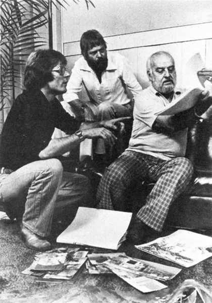
Animator Charlie Downs (left) flips drawings for director Bob Taylor.
HEIDI’S SONG is the story of an orphan girl, based on Johanna Spyri’s 100-year-old, internationally known book. The cartoon feature contains a”Broadway” score of 16 songs by veterans Sammy Cahn (lyrics) and Burton Lane (music). The characters’ voices include Lome Greene as Heidi’s reclusive grandfather, Broadway actress Margery Gray as Heidi, and Sammy Davis, Jr. as King Rat, leader of a band of rodents. Other characters include a “mean and scary ancient housekeeper,” Fraulein Rottenmeier; Sebastian, “the butler who helps Rottenmeier be miserable to Heidi”; Clara, a lonely girl “confined to a wheelchair”; Peter, “a young goatherd, agile as the animals he tends.”
Off-setting the human characters is a gaggle of animals; Spritz, Heidi’s “feisty” pet goat; Hooter, a baby owl who “warns Grandfather of Heidi’s imprisonment in the cellar”; Gruffle, Grandfather’s “gruff old hound”; Schnoodle, a “nasty little dachshund who is rotten like his mistress, Fraulein Rottenmeier.” There is also a “crusty” German Schnauzer, a white mare, a white kitten and the aforementioned royal rat, “the power-loving and peppy leader of the rats in Sebastian’s basement, who spurs his clownish rodents into a strong force to attack Heidi.”
“We do have our animals,” points out Barbera. “My gosh, if we don’t have animals, we’re in big trouble,” he notes with an eye toward audience appeal and merchandising. “But we do have humans and some marvelous dancing,” he continues. “We are not rotoscoping,” he says, referring to the technique of animators tracing frame-by-frame projections of live-action. “I don’t care for rotoscoping at all.”
Choosing talent
Hanna and Barbera have instead hired a team of 20 top character animators—”Let’s use the word humbly and respectfully: the old-timers, “adds Barbera—people like Hal Ambro and Charlie Downs, both of whom specialize in human figure animation and have worked on films such as Disney’s PETER PAN and Richard Williams’ RAGGEDY ANN & ANDY. There are also master animators of animal caricatures and comic timing, such as Irv Spence and Ed Barge, veterans of the fine Tom and ]erry shorts. Th’e great Disney/MGM animator, Preston Blair, was also involved with HEIDI for a time.
 One might assume that the difficult task of manipulating the drawn human form in full animation is what kept the film in production for five long years. Barbera, however, offers this explanation: “When we are in the slow season, which happens in television all the time, everybody has to be laid off. We were going to keep people busy on the feature. We found that doesn’t work. The kind of people you use on a feature are the old super-pros of our industry, and there are few of them left.
“Secondly, we wanted to use HEIDI’S SONG as a training ground for new animators. The first three or four years the picture would go into production and stop, then go back into production and then stop. That was not good for the picture. We were losing momentum, the enthusiasm of the artists and the excitement we wanted to build up. So finally, about a year and a half ago, we marshalled the last remnants of
__Bob Taylor, director, and animators____ what we think are the best people in the
__Charlie Downs and Hal Ambro. ________business. When we brought these people in we had to change directors. We had a fine guy, but he had forgotten how to go back and really work these old-timers — really get the good animation! We then hired a brilliant young director, Bob Taylor, who is dynamite!”
Prior to rejoining H-B a couple of years ago (he had first worked there in 1966 for one year), Robert Taylor worked for Ralph Bakshi, Steve Krantz, DePatie-Freleng and Murakami-Wolf. “I always seem to come in on things that are hopeless,” he commented recently, “and we try to turn them into hopeful. I think we’ve done it with this picture. For me and the whole crew, and for Joe and Hanna-Barbera and Taft, this is our entrance into real good quality stuff!”
It has not been a piece of cake for Taylor. When he took on the HEIDI assignment, the script was written and the tracks were already recorded. “It was a hang-up for me,” he admits. “That’s the albatross around my neck. The story is episodic. If I had written it, I would have made it a little stronger in terms of her emotions and some of the dialogue. But,” he adds brightly,
I “my whole trip is to keep the audience entertained—get people to go to animated films and make them feel when they come out that they’ve seen something they can’t see anyplace else. It isn’t so much the tools;
i it’s what the hell I’m trying to do with it.”
Trying to elicit a description of the film’s style from both producer and director is difficult. According to Barbera, “The results have been what I call a Hanna-Barbera feature. It is not going to look like a Disney picture, or a FRITZ THE CAT or a RAGGEDY ANN & ANDY. We have our own style.” When pressed, Barbera cites “some very imaginative pieces of business.” Pressed further: “We’re not holding back. When they lock Heidi in the cellar, that’s a scary place—to be locked in a basement in a house in Frankfurt in the 1880s, that’s enough to put you away. We’re not holding back, yet we’re keeping it in good taste throughout.”
New wave animation
Taylor was a bit more specific: “I hate to opportunity for the guys to get back into what it’s really all about. We take as many new animators as we can bear—the ones that have the enthusiasm and are really interested in what we’re calling a ‘renaissance.’ But even more important, we are just interested in making great animated films and updating them into the 1980s.”
The HEIDI unit has already begun production of its next two animated features, ROCK ODYSSEY (which Barbera describes as “a marvelous treatment of music from the 1950s, ’60s and 70s. A rock-FANTASIA, if you want to call it that”), and NESSIE COME HOME, a tale about the Loch Ness monster. Again, the thinking behind the choice of both projects is carefully calculated toward maximizing box office. “If you are going to do a feature,”reasons Barbera, “you must have something people will identify with. You can’t do ‘Willie the Glowworm!’ That’s why HEIDI is so great. It’s always a problem finding material. Watership Down is a marvelous book, but we would have hesitated to do it because it’s just not that well known. It’s a gamble. You have to put four to five million dollars into something like that.”
Marketing concepts for animated features
At a time when Disney films are attempting to woo an older (“PG”) audience, one wonders why Hanna-Barbera appears to be aiming toward a traditional, family-oriented “G”-rated audience with its animated features. Barbera explains: “First of all, anything that Disney has done is going to play forever, so he will have that constant market in every media. Secondly, the theater audience isn’t going to be the only audience. There are going to be cassettes, a perennial that will run forever. And thirdly, we are going to have our own style. We’re not going to have a picture that will be only for kids. We will get the adults with this one.”
“ROCK ODYSSEY,” continues Barbera, “will appeal to those between the ages of 18 and 35, but we will not lose the kids because of the animation. And we will have the adults that remember those ’50s and ’60s songs. NESSIE will have a great, I hate to use the word, ‘environmental’ appeal, but we will be protecting a character that’s getting it. If there are monsters in that lake, they get bothered—by submarines, depth bombs, cameras—more than any character in the world. We have a very unusual twist that will make it appealing.”
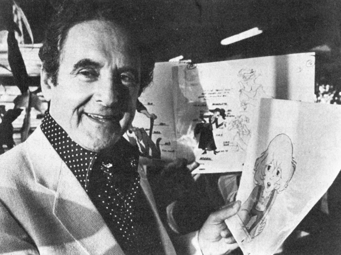
Joseph Barbara, executive producer, displays color models that some
150 animators used for reference while working on HEIDI’S SONG.
Asked whether the future might see Hanna-Barbera producing adult-oriented features a la Bakshi, Barbera answers, “Oh yes, very much! We had a recent all-day meeting where the thrust was the fact that we can’t depend on the children audiences to pay for these things. We must attract the adults, too. Statistics show there are less children around now. So whatever we do, we must attract the adults.” Barbera must have been thinking of a recent Bakshi product, i.e., LORD OF THE RINGS, for when asked if he would produce an unquestionably adult cartoon such as HEAVY TRAFFIC or FRITZ THE CAT, he replied, “No! I don’t think we would do that! We certainly wouldn’t shy away from a gutsy project, but it must bring in the kids, too. So there would be no bad taste.” For the time being, it is significant that Hanna-Barbera is training an enthusiastic crew in the techniques of full, character animation, one form of the art that for the last two decades has seemed to teeter constantly on the brink of extinction. It is enough for now that H-B is producing with integrity and care a film like HEIDI’S SONG, which will attract and appeal to large audiences.
The success of Hanna-Barbera will keep an avenue open for future animated features, and hold the public’s awareness of and interest in the medium of animation itself. With an increase in the number of future animated features will come diversity in form and content. Animation
as a vital and viable entertainment medium will then come closer to realizing its potential, as it did in 1968 when George Dunning directed YELLOW SUBMARINE, and in the early 1970s, when Ralph Bakshi excited audiences, and, indeed, as in 1937 when a struggling young producer named Walt Disney redefined the genre.
Commentary &Richard Williams 10 Feb 2009 08:52 am
Borge’s Note
I mentioned in my post this past Friday, that I had a copy of Dick Williams’
notes from Art Babbitt’s lectures at the Williams, London studio. Borge Ring wrote the following letter about those notes:
- You own a copy of Dick Williams’ notes from Art Babbit’s lectures at the studio in Soho Square.
Art drew on an overhead projector during the lessons. Dick sat there copying them into his scetchbook all the while.
Years later I asked Carol Hall – Russell’s wife – if they had copies of Art’s own overhead drawings. They did and Carol graciously sent me the lot.
It was WILDLY interesting to compare the two.
Dick’s version is – let us say – “Bobo Cannon as seen by Ronald Searle.”
Art’s personal taste in design were very influenced by UPA. Clear, compact designs almost emblematic. But when he draws a row of “little men” they are jolly in an exuberant Syverson way.
I noticed this preference of his when he corrected my animation. He would change a shoe into a UPA shoe ignoring the client’s modelsheet.
Performing the corrections he desired did not come easy to him. He put a clean sheet on top of your drawing and redrew with a blue pencil.
He did not like the result,and went over his blue drawing with a red pencil.
That wasn’t it either; so he took a black pencil and bored into the blue and red. Watched awhile …. then tore the thing off the board and started the blue pencil on a fresh sheet.
He ended up with a nice clear drawing in black pencil. I kept one, trimmed it to the size of the character and it resides in the drawer where I keep erasers and things,and greets me every time I open the drawer.
Dick’s thrifty business partner had asked me: “Now Borge, what do you think you should be paid for this job? You know, we’ve got Art Babbitt coming.”
I said: “Art Babbitt has been teaching me for 24 years, Carl. Only he doesn’t know it.”
Another gambit was: “You must have an excellent showreel. that can attract clients to us. May we borrow it?”
Now, this is like having your passport confiscated in Teheran, so I said:
“Dont worry, CarI In 3 months time you will have a new, vastly improved showreel of mine, all of it Richard Williams commercials.”
Carl Gover was a thrifty often frustrated man in a difficult Roy Disney position. I got to like him very much, and still do.
I once asked Dick what sort of artist Art Babbitt was “privately.” He said: “I don’t know. He does not consider himself an artist, and he is very shy about such matters. His wife showed me a collection of caricatures from the 20s.”
“What do they look like?”
“Beautiful”.
Art scoured the art galleries in London looking for things that might improve his animation.
Four young animators complained that the client’s (trademark) character was very corny. Babbitt smiled to the paper on his desk and said mildly: “That depends on how charmingly they can animate him. Because if they can, he will not look corny.”
Frank Thomas visited and Dick showed him a funny commercial for dogfood he had drawn in a James Thurber like style. Frank said; “I like that surface-trick-stuff you do, Dick. But I prefer real characters.”
Dick answered:: “You dont think that Captain Cook is a more real character than this dog, just because you use liveaction for reference.”
writes
Borge
 ps: The Dutch art authorities are justly proud of their heritage of Rembrandt and Vermeer etc etc etc and you might expect them to be condescending towards an artbook showing 25 years of The NewYorker frontpages.
Not so.
A review by a top guru in a quality newspaper said. “These are so-called commercial drawings which means that they will never find their way into a museum. But I would gladly exchange all the museums for these drawings. Because they are the best collection of drawings of this century.”
I played hobby jazz with some other oldies. The vibraphone player was a bigshot at the Rijksmuseum in Amsterdam. He got me invited to exhibition openings. “Are you coming sunday for Da Vinci? We have a new sherry.”
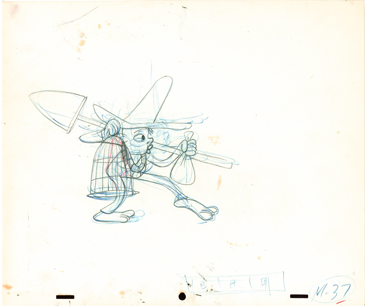
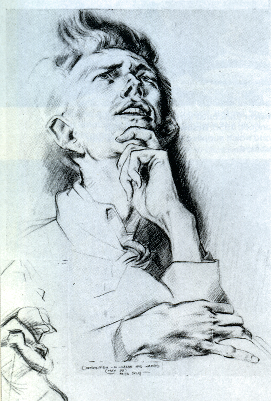
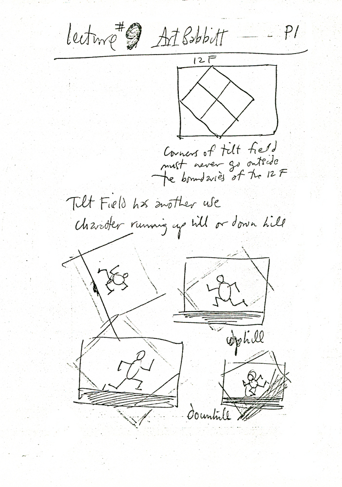
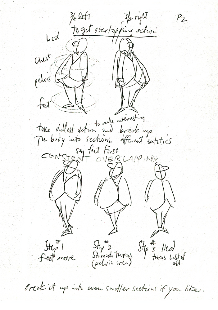
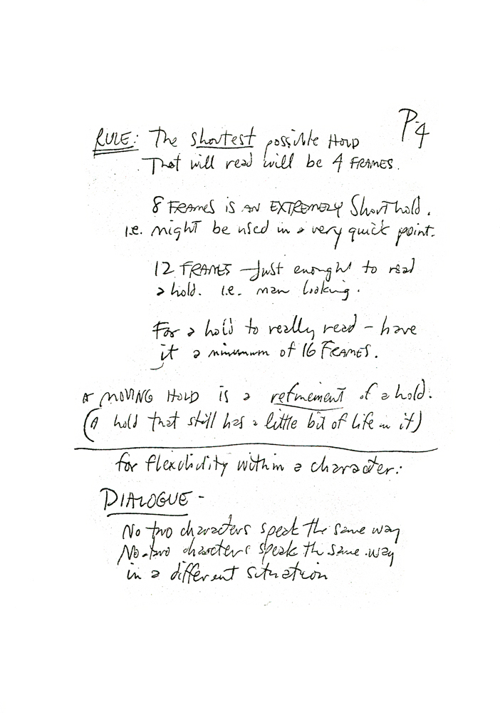
Dick’s notes Chapter 9.
 2
2 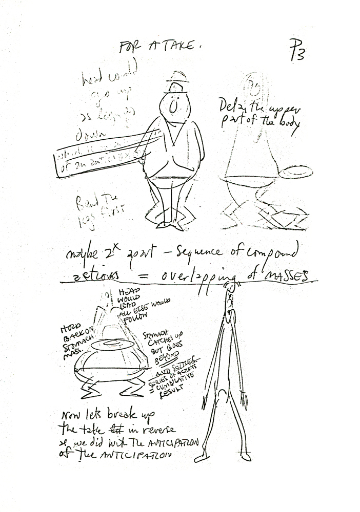 3
3(Click any image to enlarge.)
 4
4  5
5
 6
6  7
7
 8
8 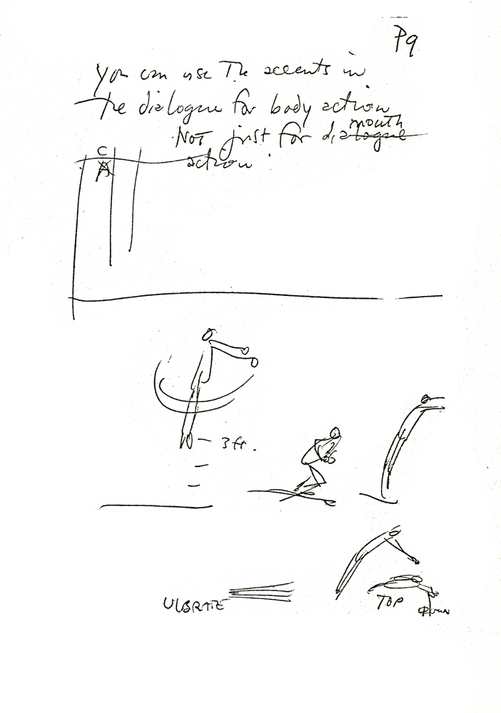 9
9
Animation &Frame Grabs 01 Jan 2009 09:09 am
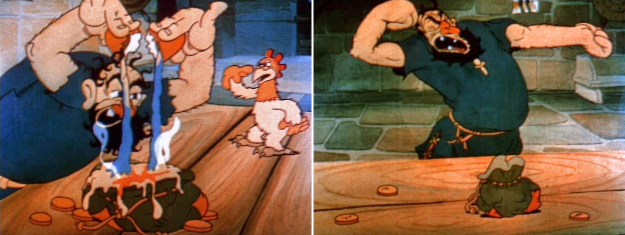
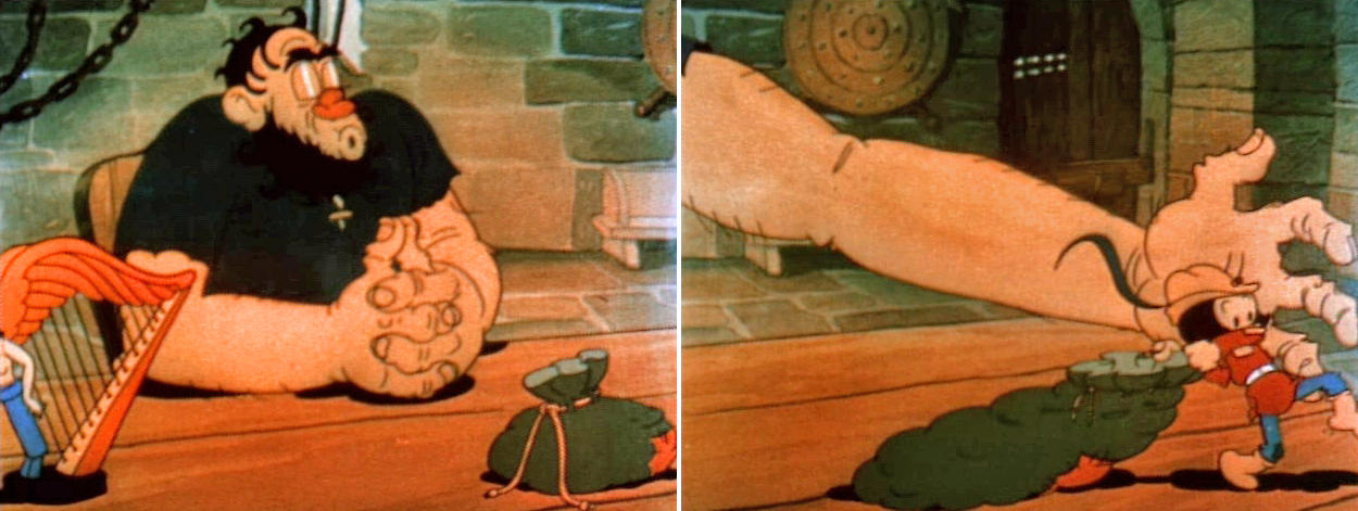
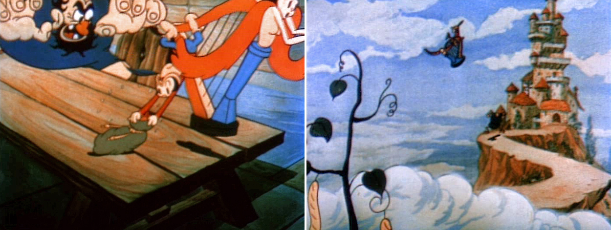
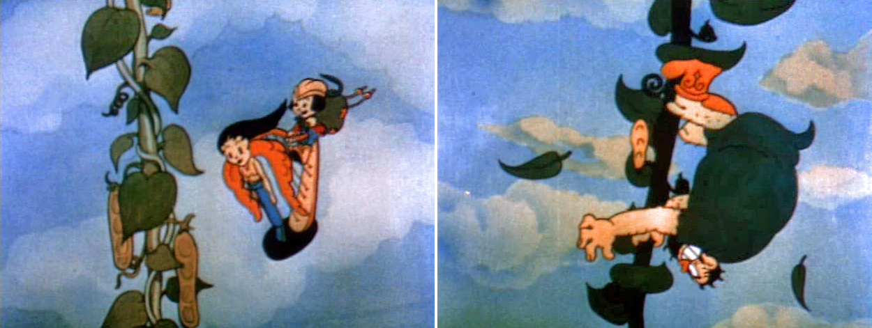
Beanstalks
- For New Year’s Day, I’m going to go back to the beginning. My beginning – or at least the day I think I truly came to understand what animation involved and how much I really loved it.
(Click on any image to enlarge.)
I was 12 and had saved my entire summer savings working as a delivery boy for a pharmacist not far from my home. All I made was tips, and the summer had brought me a full $30.
I wanted a projector to watch films. If I was going to make cartoons, I had to have a projector. (Who thought about having a camera to watch them!)
My mother sat down with me – we lived in the Inwood section of far upper Manhattan. She gave me a home-drawn map of the city and told me how I could get there by train. On my own, I took a subway trip to 42nd Street and headed for Peerless Cameras. This was a camera store near Grand Central which would later merge with Willoughby to become Peerless-Willoughby.
They had used 8mm projectors (before the invention of super 8 ), and I intended to go home with one. I did – $25.
Of course, I needed something to project, and Peerless had a VERY LARGE section of entertainment films – 8mm & 16mm. Castle Films distributed many of the Ub Iwerks shorts (most were B&W prints.) They were cut down a bit from the full film, and title cards were edited into them. Obviously, the 8mm projectors and films were silent back then (we’re talking about 1959.)
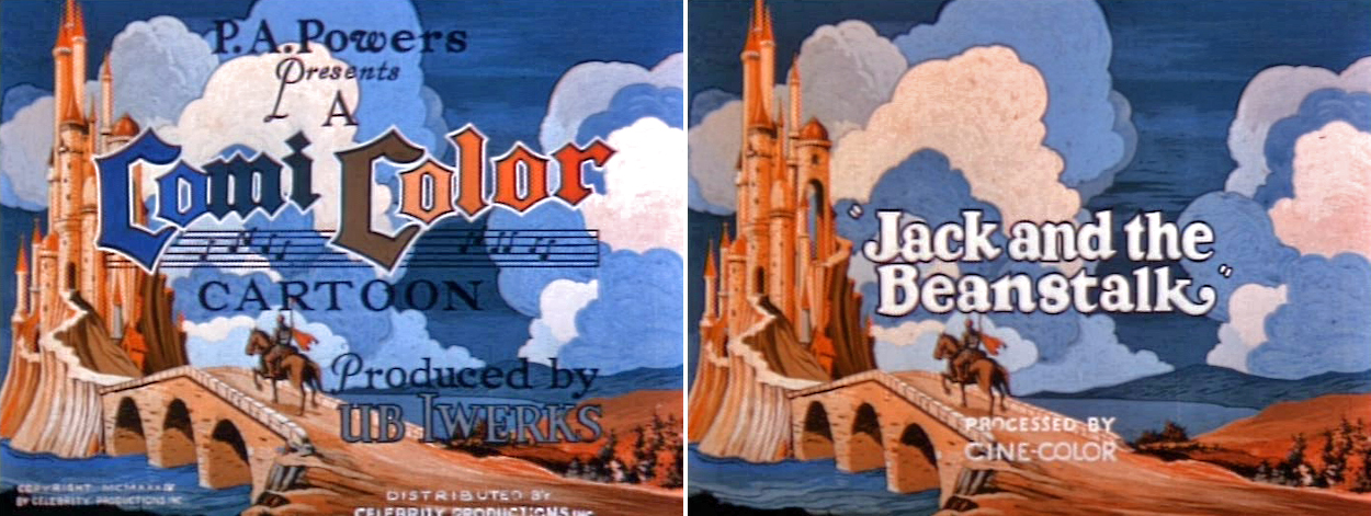
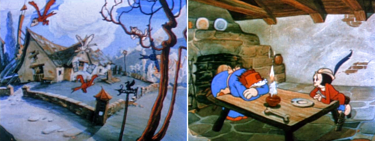
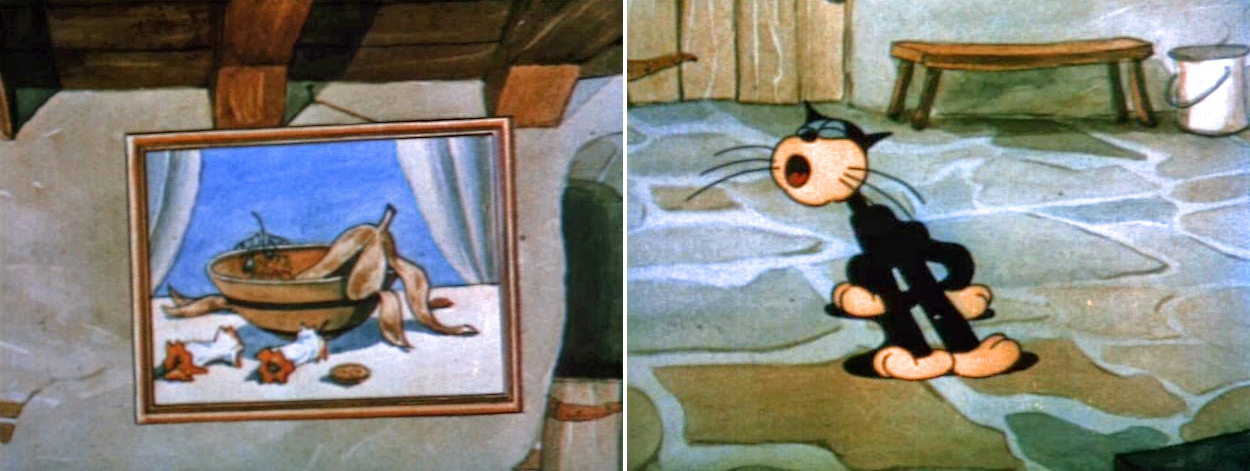
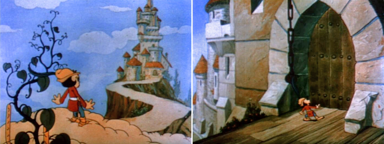
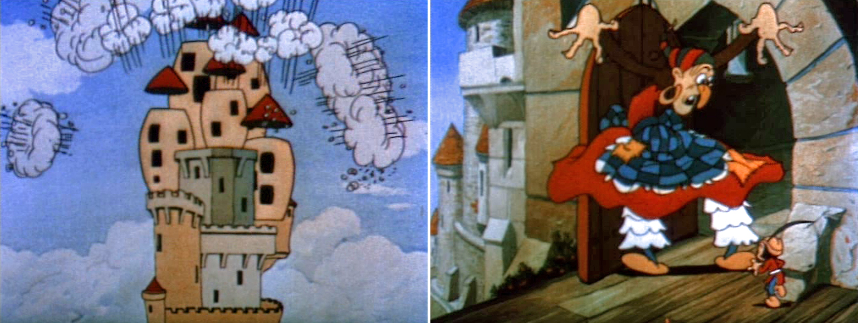
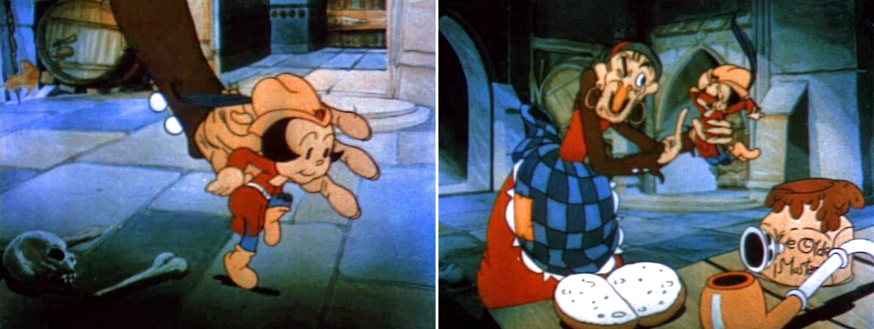
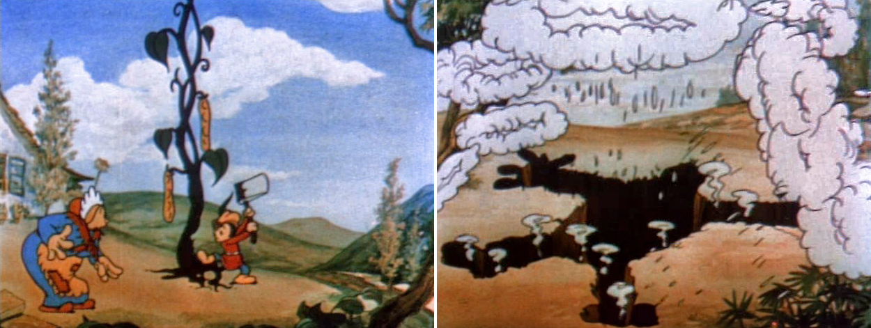
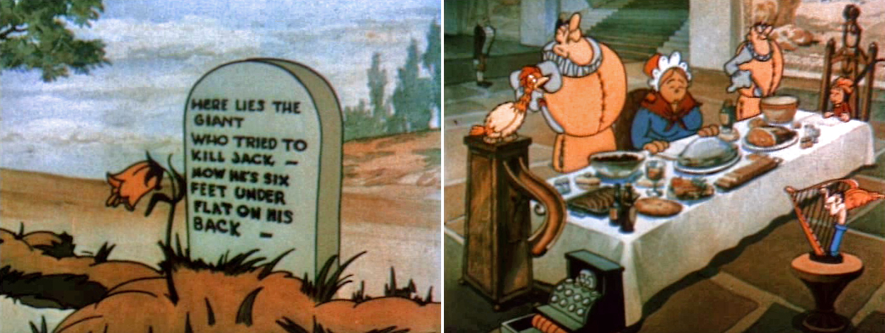
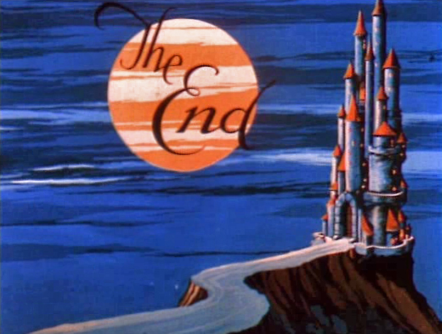
I’d known the name of Ub Iwerks since I was 8. He was as close to an animation hero as I could muster at that young age. I’d read all about him and knew of the period when he’d had his own studio. There, in Peerless, was Jack and the Beanstalk, and this was the first film I bought.
I felt absolute delight watching that film an endless number of times. The film was, as I said, in B&W, but this actually enhanced some problems old Ub had faced when he started out.
The color paints, for example, weren’t so smooth to lay down. The hand of the bean-seller streaked like crazy and was more obvious in the B&W version. The same was true of the giant’s hand later in the film. Obviously, any time they mixed white into their colors, they couldn’t get it consistent. Terrytoons had this problem well into the 40′s.
It was fun noticing the many elements that made up the film. There were special effects in the film. I’d known that Iwerks was involved in “Special Processes” at the studio (whatever that was – it had to be effects), so you could look at what he did in his own studio. The dark house in the rain storm, illuminated by the lightning was impressive.
Also, the characters were so wacky, you couldn’t help but be entertained by them. The drawing shifted all over the place, but despite the fact that I noticed this – at the age of 12 – I also knew I didn’t mind. You always knew who the characters were even if they went wildly off model.
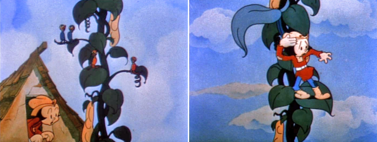
Every once in a while, there was a hint of a “multiplane-like” effect. When Jack stepped off the beanstalk and onto the clouds, the cel levels move into a position so that the illusion of depth is attempted. It’s handled nicely, I have to say.
Of course, it was a bit of a surprise to find that I couldn’t stop the projector one frame at a time. I wanted to do more than watch the film over and over and over and over and over (which I did.) Eventually, I got tired of this and started tinkering with the machine. I had to be cautious so as not to jar the bulb which could easily burn out and cost me another five bucks.
There was a framing device on the projector. Sometimes the frame line was in the picture and you had to turn this knob to properly frame the picture. By turning this an ungodly number of times, you could actually advance the frames, but you couldn’t see more than about four frames at a time.
That wasn’t quite good enough, so I ultimately started taking the projector apart. I was able to rework the framing mechanism so it could keep going. I was able to watch the film one frame at a time and truly study the animation.
I can’t tell you how many hours I pored over this film.
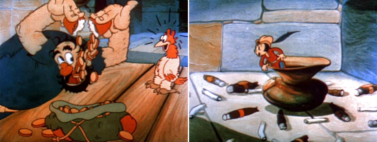
There was a scene where the giant watches money falling out of the hen’s golden eggs. His one eye follows the coins down (and later follows the rotten egg leaking into the money bag.)
I remembered this scene well when studying some drawings Tytla had done of Stromboli counting his coins. His eyes are similarly loose as they follow the coins to the table, and I wondered if he had known about this giant animation.
Back then, I wasn’t aware that Iwerks hadn’t drawn the entire film by himself. I eventually came to learn that Grim Natwick pretty much ran the studio for quite some time and was replaced, after he’d left for Disney, by Shamus Culhane.
Years later, when I first met up with Grim Natwick, I told him that this film was the very first animated film I’d studied and studied in my goal of becoming an animator. He didn’t offer much of a reaction.
It was a real treat taking this film apart. I started out knowing nothing and soon learned that animation had many decisions and choices behind it. Even today I get a twinge of excitement when I first look at this short – I’m sure it’s as much nostalgia as anything.
In short, it’s all so much easier today. Get a dvd through the mail, look at it on YouTube. Get an animation program like Flash and wallah you’re an animator. There’s no effort. Maybe there was an advantage to having to make an effort.
Here’s the link to the YouTube version of the Jack & the Beanstalk.
And here’s the link to vol 1 of The Cartoons That Time Forgot.
Happy New Year
Articles on Animation &Puppet Animation 15 Nov 2008 09:44 am
Harryhausen Interview
- It’s been a while since I’ve posted anything about stop-motion animation, and seeing an attractive poster for Coraline made me realize it was time. I’ve recently posted some articles from the Millimeter/1975 animation issue which was edited by John Canemaker. This is another excellent piece from the same magazine, and I think it a good one.
An Interview with the Master of Stop-Motion Animation
by Mark Carducci
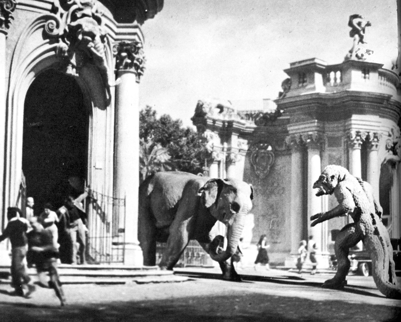
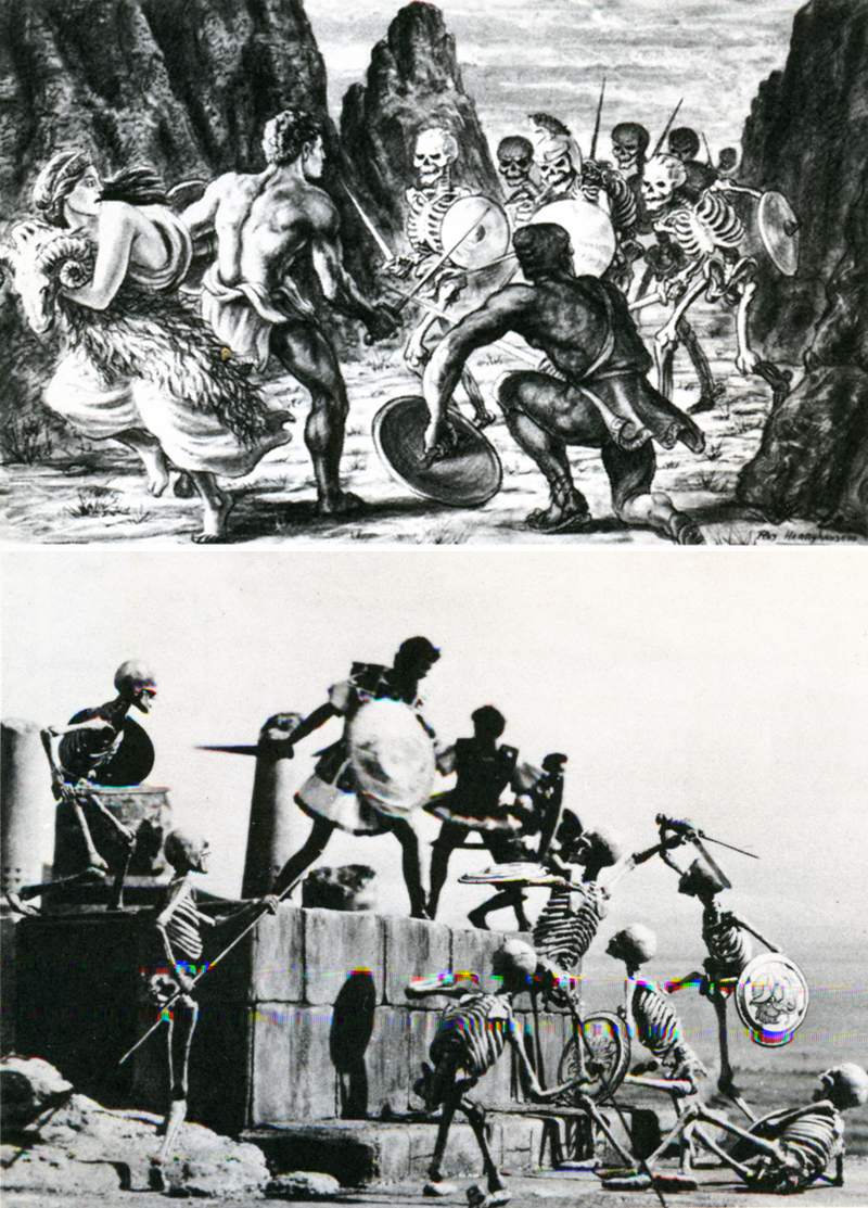
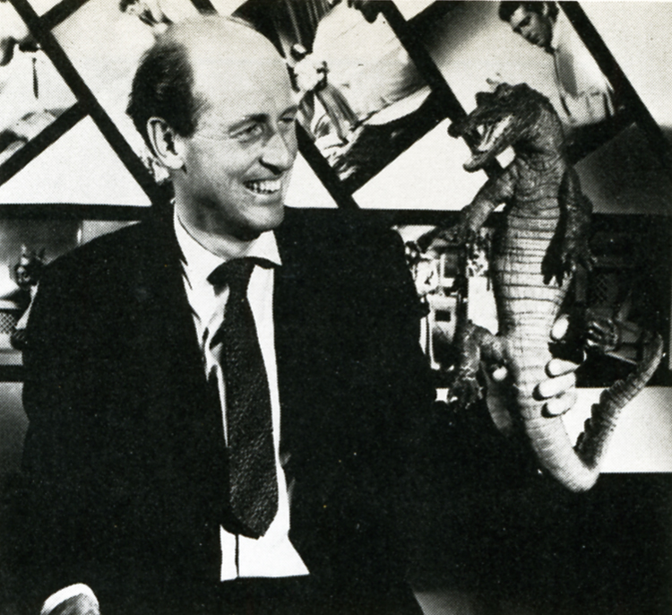 Film history records the earliest three-dimensional animator as George Melies, the showman-turned-filmmaker of A TRIP TO THE MOON fame. Melies, unlike many special-effects men of today, realized the value in using several different effects processes at the same time. Thus he would utilize stop-action, animation, miniature photography and mechanical effects all in the same frame. Melies was a pioneer in the field of effects animation in three dimensions, and he paved the roads other animators would one day travel. One such traveler was Willis H. O’Brien. O’Brien single-handedly elevated the techniques of three-dimensional model animation to a fine art, beginning in the silent era with short subjects and continuing through the 1925 classic THE LOST WORLD to KING KONG a mere eight years later. As Kong was king of Skull Island, so O’Brien was king of model manipulation, and tike Melies before him, O’Brien never missed an opportunity to add drama, atmosphere or pathos by mixing effects together. Witness the clash between Kong and a flying reptile atop Kong’s mountain lair: Kong and the pterodactyl are jointed foot-high foam rubber models; the mountain’s ledge is a plaster recreation; the sky background is a painting on glass; the flying reptiles in the sky are double-printed eel animation. It was this intelligent and intentional combining of effects that allowed O’Brien to achieve the marvelous sense of reality he did in KING KONG, a reality so intense as to make a thirteen-year-old named Raymond Harryhausen choose the field of special effects animation as his life’s work.
From the time he saw KING KONG in 1933, until the mid-40′s, the youthful Harryhausen animated in what might be called a highly animated fashion.
He even managed, on several occasions, to gain an audience with his future mentor. Though Ray’s fledgling efforts were crude, O’Brien saw in them a promise of future greatness, and he was quick to offer constructive advice to his precocious- protege whenever he was asked. In 1946, impressed by Ray’s solo efforts in producing a series of animated fairy tales; O’Brien offered him encouragement of a more concrete nature: a position as an animator on the Merian C. Cooper production MIGHTY JOE YOUNG. Of this opportunity-of-a-lifetime Harryhausen recalls: “It was, of course, the climax of a long-awaited dream come true. I had a magnificent two-year period of working with O’Brien, during the long pre-production and design stage, up to the end of animation photography. He was so involved in production problems that I ended up animating aboul 80% of the picture.”
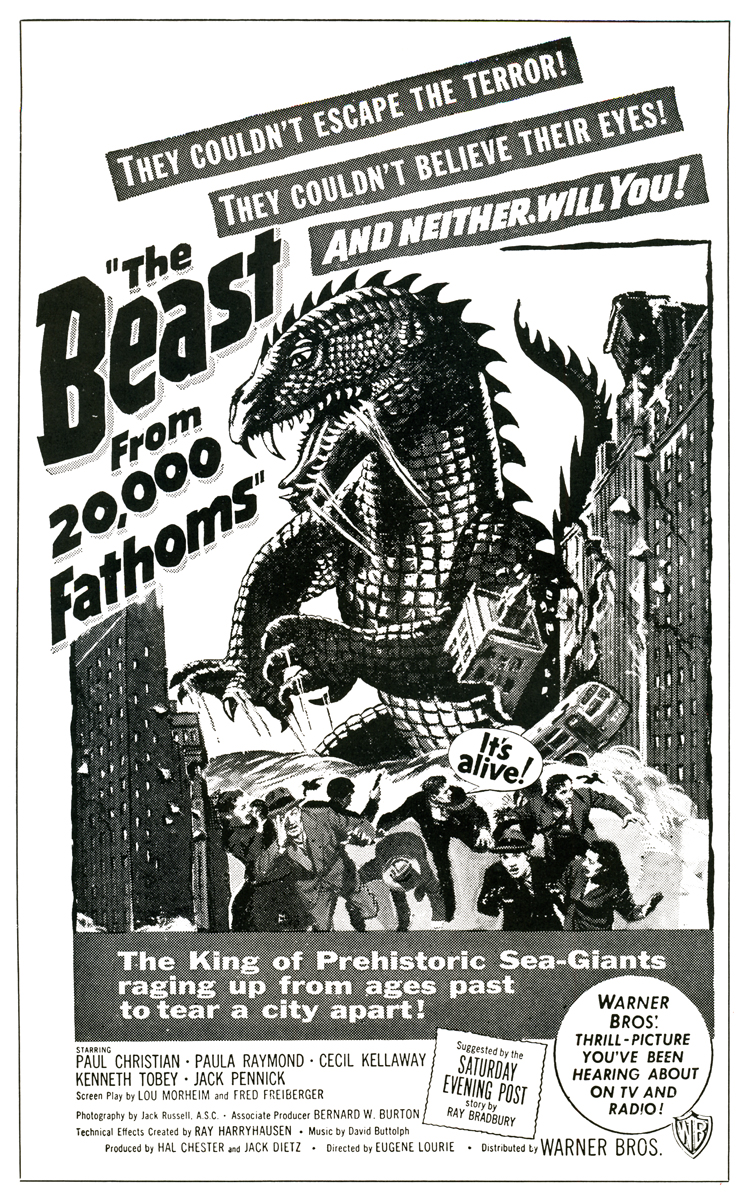 In 1952, as a result of his Oscar-winning work on MIGHTY JOE YOUNG (Best Special Effects of 1949) Ray was approached by Jack Dietz and asked to create the effects for THE BEAST FROM 20,000 FATHOMS. These he executed ably, employing an innovative front-projection system of his own design, as the preferable but more expensive rear-project ion equipment the work called for was outside the boundaries of Dietz’s budget. THE BEAST came in at $200,000, a remarkably low figure considering the expertise and high quality of Ray’s animation and effects. Audiences of 1952 flocked to the picture in droves, making it the unexpected sleeper of the year for Warner Brothers. Completing THE BEAST left Ray on the brink of a long, creatively satisfying and financially rewarding association with a then-youthful producer, Charles Schneer.
Schneer wished to produce a script about a giant octopus that terrorizes San Francisco, and after meeting hirn^ {Schneer, not the octopus) Ray agreed to work on the picture. The result was IT CAME FROM BENEATH THE SEA, the first of a series of ten feature films produced by Schneer with special visual effects by Ray Harryhausen. Along the way, Ray has freelanced twice: once in 1958 to animate the dinosaur sequences in Irwin Allen’s THE ANIMAL WORLD, and again in 1966 to handle effects on Hammer Film’s OWE MILLION YEARS B.C.
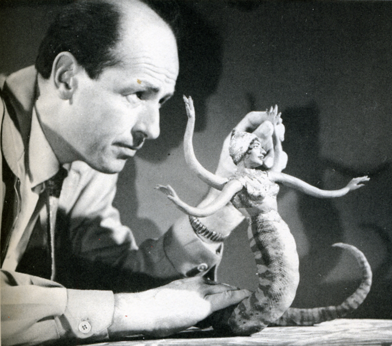
 A comparison of the work of Ray Harryhausen and Willis O’Brien yields some interesting observations. One of O’Briens trademarks throughout, his career was his use of glass paintings. The three-dimensional effect of the jungles of Skull Island was achieved through the painting, on glass, of dense trees and vines. By animating his models behind several layers of these realistic depictions of forest, O’Brien was able to achieve an illusion of depth that added tremendously to the dramatic impact of the entire film. O’Brien was a dramatic romantic, and a stickler for any detail •haqlbuld romanticize. Harryhausen, on •hefOtner hand, is a realist, and in his Jiifork there is a sense of reserve; of a wpjehful eye on the cost of each particular effect. No layers of intricate glass paintings for him—too expensive. For Ray’s purposes a simple but effective matte painting will suffice. The net result is always a little less atmospheric than O’Brien’s work and ultimately less powerful. To compensate for this Harryhausen outshines his master in the fluidity of his animation. His smoothness of movement of his foam rubber creatures is the most striking difference between his and O’Brien’s digital prestidigitation. In this area the pupil could have taught his teacher.
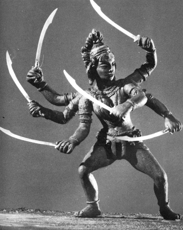
 The exact processes by which Harryhausen combines his animated models with live actors are ones he prefers to anyone with a basic of animation can grasp the*1 rudiments of what Schneer and Harryhausen have dubbed “Dynarama.” Let us take an example from Harry-hausen’s latest film, THE GOLDEN VOYAGE OF SINBAD. The script called for a battle between Sinbad and a giant one-eyed centaur. The first step in creating the illusion of a human dueling with a mythical monster was to film the actor, in this case John Philip Law, leaping to and fro fighting with an imaginary creature. The resulting footage is loaded onto a rear-screen projector which has been modified to move a frame at a time instead of at sound speed. In front of this rear screen, Harryhausen constructs a miniature set, which corresponds to the full-size one on the film in the projector. Placing his foot-and-a-half tall centaur into this miniature setting, Harryhausen animates it a frame at a time, being careful to similarly advance the rear-projected image of Sinbad. Re-photographing this entire set-up with a locked down animation camera produces the desired effect. This description can only serve to illustrate the bare bones of the Dynarama process. Many sequences have required much more complex techniques of Ray and his equipment. As a result the time element involved in the production of a Dynarama picture is staggering. Pre-production lasts six months to a year. Principal photography lasts several months and the animation photography consumes an incredible year or more! But the results, which speak for themselves, have always seemed to justify the commitment of two or three years of Ray Harryhausen’s life; at least in the past they have.
 At present Ray is involved in yet a third film about the adventures of the swashbuckling Sinbad, though he characteristically refuses to give details about the project. This is understandable, since at the time we spoke he didn’t even have a story-line. This, too, is characteristic; perhaps unfortunately so. For it is in this area, the script, that Ray’s films have shown their vulnerable underbellies. Starting as they do with Ray’s sketches of the fantastic monsters involved, most Dynarama films are built around a monster or monsters on the loose. Plot, dialogue and characterization have always played second fiddle to special effects in Harryhausen’s films, and this is nowhere as painfully obvious as in THE GOLDEN VOYAGE OF SINBAD. Although his cart-before-the-horse method of scripting has always netted Harryhausen films of a very satisfying financial nature, it has never netted him a film with the impact and scope of KING KONG, and never will. One can only hope that as he has more say in his productions than any effects animator on earth, (he is a co-producer) Harryhausen will one day put as much creative energy into his script, casting and choice of director, as he does into his visuals. Perhaps then the day may yet come when Dynarama films will have some saving graces beyond their impressive opticals. Be that as it may, for anyone at all interested in animation and effects cinematography, the words of the grandmaster of Dynarama paint a fascinating portrait of a seldom glimpsed phase of film production.
M.C.: Have you ever considered remaking the film which first inspired you, KING KONG?
R.H.: Yes, but KONG couldn’t be re-made today without spending vast amounts of money. The time and cost involved in doing all those glass paintings would be astronomical. You know O’Brien really developed the technique of glass painting single-handedly. In a way his use of them was a forerunner of Disney’s multi-plane camera. On KONG Obie had animation tables sandwiched between the glass paintings, and on these tables he’d place his models. He needed a tremendous amount of light for the camera to record through all those panes of glass. Often a light would blow in the middle of a scene, ruining a shot he had worked on for days. To remake KONG would be much too complex a thing to get into today.
M.C.: Some hold the opinion that your films have little merit aside from their impressive effects. I don’t mean to criticize, but I tend to agree with that, excepting MYSTERIOUS ISLAND, a Him I feel could stand alone if the footage of the monsters was cut.
R.H.: Really? I don’t think you would feel that way about MYSTERIOUS ISLAND if you actually did cut that footage. Pick up an 8mm version some time and try it. (Laughs) The original Jules Verne novel was really just a tale of survival on a desert island. The survivors in the story saw rather mundane things, so we modified their adventures a bit by adding Capt. Nemo and his giant creatures.
 M.C.: With newer and better emulsions now available in 16mm, have you considered working in that gauge?
R.H.: No, I have no reason to work in 16mm. With 16 you don’t have the options and accuracy of 35mm and the optical printer. Certain subjects might show up quite well on a blow-up from 16, but my work is much too complicated to further complicate it by working in a smaller gauge than 35mm.
M.C.: What about 70mm?
R.H.: We released FIRST MEN IN THE MOON in 70mm, but that was a blow-up from 35. Shooting on a 70mm negative is too costly a proposition, necessitating the use of too many specialized pieces of equipment.
M.C.: FIRST MEN was shot in Panavision. What effect did shooting wide screen have on your usual methods?
R.H.: I was forced to re-design many things, because certain techniques are impractical in Panavision. I relied more heavily on traveling matte work in FIRST MEN, whereas normally I might have used front or rear projection.
M.C.: you are quite active in other areas of production besides animation photography. Have you ever considered directing an entire film?
R.H.: Oh, yes, I would very much like to direct if I find the right subject. But it’s a big job just to keep track of the special effects. There’s a limit to how much one man can do.
M.C.: Didn’t you once remark that you were unhappy with the animation of the miniature horse in THE VALLEY OF GWANGI? If so, why?
R.H.: No, what I did say was that it was a sequence I ‘dreaded doing because the horse really didn’t have anything dynamic to do. It just had to sit there and look coy. It’s always difficult to decide what to have the creature do in scenes like that. An action sequence involving a giant animal is much more impressive. So I let that scene go until last.
M.C.: Box-office-wise your films have usually done quite well. How can you account for the relative failure of THE VALLEY OF GWANGI?
R.H.: It was released at a time when Warners was being sold and it received very poor distribution. There was no advertising to speak of and nobody knew what the picture was about.
M.C.: Alternately, THE GOLDEN VOYAGE OF SINBAD has really hit big with audiences here.
R.H.: You must remember the time when GWANGI was released. Everyone was on a sex binge then, and we only had sexy dinosaurs. Warners didn’t push the picture at all. Columbia, on the other hand, has put a great deal of effort into their campaign for GOLDEN VOYAGE. That and word-of-mouth really paid off.
M.C.: In the past you have utilized the talents of film composer Bernard Herrmann for your scores. Why was he not used on GOLDEN VOYAGE?
 R.H.: There were many reasons. Sometimes people are tied up, and sometimes the situation just isn’t conducive to getting the people you would prefer. I think the composer we did use, Miklos Rozsa [SPELLBOUND], writes a different kind of music than Herrmann, and that he did a very good job for us.
M.C.: Taking his past efforts into account, why was Gordon (THE OBLONG BOX) Messier chosen to direct GOLDEN VOYAGE?
R.H.: Again, there were many reasons, and I can’t go into them here. I think Hessler has a very good sense of direction. You must remember that the quality of each picture a director works on depends largely on how much money is in the budget. Some people think we have carte blanche to make a picture any way we please. Except for a David Lean or a Stanley Kubrick, this is not the case. We make a commercial product, and though there are many things we might like to do on a picture, it always comes down to whether or not the money is there.
M.C.: All told, how long were you at work on the effects for GOLDEN VOYAGE?
R.H.: About a year. All the work was done here in London at Gold Hock Studios.
M.C.: Did British Museum sculptor Arthur Hayward assist you in constructing the animation models, as he had on ONE MILLION YEARS B.C. and GWANGI?
R.H.: No, I had others assist me. Molding and casting are very time-consuming jobs, so I farm some of it out to certain individual. I can’t do all the models myself, because I don’t have the time.
 M.C.: Do you paint your own matte paintings?
R.H.: No, I don’t. In fact nowadays I try to avoid using them. There are very few people who can do them well enough so that you don’t have to cut away from them right away. Today it’s practically a lost art, unfortunately. Most of the ones in my other films were done by staff matte painters at Shepperton Studios.
M.C.: I found there was quite a bit of grain in GOLDEN VOYAGE. Why was this?
R.H.: We worked with dupes quite a lot. There are shots in the film where you’re looking at a third-generation dupe, so naturally there’s an increase in grain. Another reason you might have spotted some excess grain was because we printed several optical zones and dolly shots on the printer.
M.C.: What can you tell me about your next film project?
R.H.: It’s called SINBAD AT THE WORLD’S END, and that’s about all I can say. We have a formal company which releases information to the public, and at the moment I’m not at liberty to say anything more. Does that pacify you? (Laughs)
M.C.: Not really. Will John Philip Law again play Sinbad?
R.H.: That depends on his availability, and the characterization in the script, which we don’t even have yet. There have been several Sinbads—Douglas Fairbanks, Kerwin Mathews, Guy Williams. We would like to give him a different quality each time. The irony is that when you knock yourself out to make a picture different, the critics chastise you for not putting in the expected cliches. One reviewer said of GOLDEN VOYAGE that he missed the dancing girls. Now that is a typical Arabian Nights cliche that we avoided on purpose.
M.C.: I have one final question concerning THE SEVENTH VOYAGE OF SINBAD. There is a sequence in that film which depicts Sinbad’s crew walking up the beach loaded down with fruit. There is a black man in the crew, and he’s carrying a watermelon.
R.H.: Oh no…(torrents of laughter at this) only a member of today’s generation would notice something like that. I assure you it was all accidental as to who got what prop.
Thus satisfied that THE 7th VOYAGE OF SINBAD contained no racist undertones, I bid Mr. Harryhausen a fond farewell, leaving his Kensington High Street home for the bleak and foggy streets of London. As I ambled towards the nearest Underground I gave additional thought to the question of Mr. Harryhausen’s responsibility for the over-all quality of his films. Approached on an adult level they are rather silly entertainments. But for a child they create a vivid fantasy world where skeletons come to life and fire-breathing dragons battle with cyclops. I was a child once, and the marvels of Harryhausens monsters, both mythic and imaginary, overwhelmed me. There is a definite place in cinema for this type of film. The adult critical eye must squint a bit to watch THE GOLDEN VOYAGE OF SINBAD, but if that’s not enough, one can always leave the theatre to the little people, whose eyes Ray Harryhausen’s films are created for.
