ArtSeen
CHUCK CLOSE Red Yellow Blue
On View
Pace GallerySeptember 11 – October 17, 2015
New York
Chuck Close once said in an interview in the pages of this publication that “Painting [. . .] makes space where it doesn’t exist, but you relate to it through life experience.” If a viewer takes pause from looking at the new paintings on display in “Chuck Close: Red Yellow Blue” at Pace Gallery in order to observe her surroundings, she will note the insight of that remark. For along with everyone else present in the room, her body is participating in a dance. From far away one is compelled to examine the individual components that make up his current, abstracted portraits up close, yet in proximity it is jarring to find that the image has nearly disappeared before the eyes. Back and forth, back and forth across the gallery we waltz. Close’s work demands this physicality, as if the body, in its exercise, is unconsciously responding to the arduous labor that goes into each of the works.
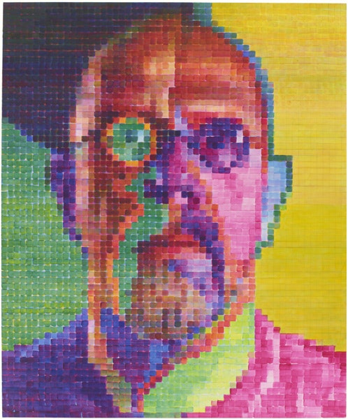
His process of painting is by now familiar to many. On a smaller portrait image, the artist overlays a meticulous grid, which is then superimposed onto a much larger canvas; he divides each one into scores, sometimes hundreds, of smaller squares, which he then paints in individually, by hand. (In the rear of the gallery hang small, color test maquettes on paper that help elucidate his efforts.) That he has been quadriplegic for more than twenty-five years and uses his brushes by means of a special device attached to his arm renders this fact ever more poignant. Close, who is known for imposing a set of rules on a given body of work, has here set himself the task of painting with only three colors: magenta, yellow, and cyan (the red, yellow, blue of the exhibition’s title) in thin washes of oil. By applying layers of paint in seemingly infinite combinations to each little square, he has produced an electric and dazzling array of color. Throughout the gallery one is struck by a melon orange here, a Caribbean blue there, a lip-gloss pink elsewhere. That the candy-store hues that make up the paintings ultimately achieve an introspective and meditative body of work is part of their alchemical appeal.
The genesis of this body of work is found in the second room of the gallery, where the three paintings Cecily (2013), Cindy (2013), and Cindy II (2012 – 2013) all hang. Close began his rigorous three-color experiment with these works (which depict painter Cecily Brown and photographer Cindy Sherman, respectively), but the rest of the exhibition is given over to self-portraits. The largest and most commanding of these, Self-Portrait I (2014), is also the most incandescent. Against a tricolored background roughly one-third each in sea green, sunshine yellow, and a murky purple, Close’s visage pops. The left side of his face is composed of a grape-green eye and beard, while the right is an eggplant purple. The juxtaposition of color produces a divine effect. From a distance, the painting dominates the room and appears all-seeing. As if the eyes had a life all their own, they seem to follow one’s movements across the floor. Owing to the sharpness of the colors and their strong contrasts, this work above all the others also retains the most definition up close, and conveys the powerful fortitude of vitality.
But one of the small miracles of these paintings is that the miniscule squares that make up each individual work are like DNA, and every combination produces a strikingly different result. One of the latest paintings hanging, Self-Portrait I (2015), achieves an entirely opposite emotion. Despite the initially cheerful palette of grapefruit, lemon, and bubble-gum, the work conveys a certain contemplation and wistfulness. Close’s face is far more obscured, the features less articulated, which results in an almost apparition-like appearance. (In her text in the catalogue that accompanies the show, Nancy Princenthal astutely notes that Close’s delineated blurring seems to have anticipated our pixilated age.) Even from a distance, the eye repeatedly tries but fails to snap the image into focus. Instead, the portrait is left intentionally obscure, countenance fading into its background.
Does it ever get easier to bear oneself for the world? Perhaps not. Close has long made himself one of his primary subjects, but nonetheless the vulnerability that is evident in these current works is both raw and affecting. He has been working steadily for more than fifty years, many of those under intense physical adversity. These Janus-faced emotions—of resilience and reticence—might indicate an artist reflecting on a long and storied life and career.
