- India
- International
Saturday, May 04, 2024
Journalism of Courage
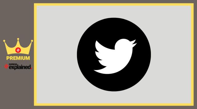 While the idea of the Bird had probably first emerged in 2006 itself, it would take four years for a bird to be finally trademarked.
 Yesterday (July 24), ‘Chief Twit’ Elon Musk announced the ouster of the beloved blue Bird Twitter logo, to be replaced by a slightly less imaginative glyph that mathematicians spend their life looking at.
“And soon we shall bid adieu to the twitter brand and, gradually, all the birds,” Musk had tweeted on July 23, before releasing the new ‘X’ logo a day later.
It is rare to see a brand let go of a widely recognised iconic logo, especially at a point where it still has millions of active subscribers – no less than 450 million monthly – worldwide. Time will tell how the new logo will pan out, though early feedback, both about its design and copyright potential, is far from promising.
As we bid farewell to the Twitter Bird, a final toast.
Twitter was founded in 2006 by Jack Dorsey, Noah Glass, Biz Stone, and Evan Williams. Its origins lay in the idea of “using an SMS service to communicate with a small group”. At the time, however, both the name and the product needed more work.

The earliest logos were wordmarks (name of the brand written in a distinct style) of the word ‘twttr’ in green gooey letters in 2005, and then ‘twitter’ in bright blue letters at the public launch in 2006. These were definitely products of their time, with fat round letters and a distinct disdain for today’s more minimalist aesthetic.
Now, while the idea of the Bird had probably first emerged in 2006 itself, it would take four years for a bird to be finally trademarked. After going through a few different iterations, the “Larry the Bird” logo was chosen, so named by co-founder Biz Stone after Boston Celtics legend Larry Bird.
The version trademarked in 2010 would undergo a number of tweaks and modifications to become the more iconic Bird that Musk is now ditching.
A perfect bird
The Bird, in its latest version, came into being in 2012 from the pen of San Francisco Bay area designer Martin Grasser. In many ways, it is the perfect logo.
Working with the previous “Larry the Bird” logo, Grasser made it such that the small fluttering bird would be unmistakable even in the smallest icons on a modern device. It is simple in form, balanced in terms of visual weight distribution (visual weight refers to the measure of the force that elements in an image exert to attract the eye), and easily recallable – all the ingredients of a good, effective logo.
The old “Larry the Bird” had a caricaturised feel to it with all four feathers made up of different shapes, a longer pointier tail and a tuft of crown feathers, which added complexity to its contours. The 2012 logo shed the extra baggage by reducing one feather and regularising the remaining three. It shortened the tail, making the silhouette more compact, and all-together got rid of the mascot-like crown tuft.
Moreover, all lines were made from the same kind of curve – circles. This ensured that the tail, body and the head blended with each other smoothly. If one looks at the logo carefully, the curve forming the top of the wing extends into the bottom of the beak. These uniformly flowing curves make the proportions pleasing to the eyes.
Alongside its shape, the distinct light blue and white colour scheme for the form and space (often used interchangeably), also comes in handy while navigating the thumb through a screen full of logos to the right icon with the least chances of making an error.
You see, human brains are extremely efficient at registering, recognising, & remembering images. Ask yourself which is easier to forget, a name, or a face? Logos are faces that brands project directly into the minds of their users.
Every pleasant experience with the brand reinforces its (good) image in our brains, every disappointment takes away a few likability points. Conversely, every pleasing logo raises expectations from a brand, and gives us a feel for what it stands for.
Take the Bird, for instance. Its stance exuberates confidence and its whole profile is stout and compact – just like a tweet. Most notably, the upward pointing beak almost sings an ode to freedom that is at the very core of the service Twitter provides.
A good logo is something that one can easily, immediately and unmistakably associate with the brand to the point that it is synonymous with it.
This is what made the Twitter Bird such a great logo. The massive outpour of emotions for the Twitter Bird is a testament to its design genius. In over a decade of its existence the Twitter Bird became an ubiquitous part of the lives of millions, and one of the most recognisable logos in the world.
In fact, the Bird was so good and synonymous with Twitter, that the company dropped the wordmark from the logo all-together. Like Nike’s Swoosh, simply the blue Bird was enough.
Why fix something that is not broken?
Regardless of Elon Musk’s obsession with the letter “X”, in purely design terms, it is not a great logo. The current iteration looks like something that a designer would have come up with in less than an hour of font-hunting on Dafont. It is extremely generic: unlike the Bird, it does not immediately stand out in a world inundated by logos.
Moreover, it seems an absolutely needless change to make – after all, ‘why fix something that isn’t broken?’. But Elon Musk owns SpaceX, has a Model in the Tesla lineup named Model X, so he is going for something he likes.
However, semantically an “X” is an unknown, a mystery, uncertain like the future, and possibly something extreme or unlimited. And in black, it is as unfriendly as it is powerful. While the final verdict is still to be made, of now, the black “X” stands in stark contrast with the friendly happy Bird of the past, in youthful and spirited blue.
(The writer is a freelance design consultant based out of Ranchi, working on brands, products & urban environments. He is also a Design Thinking evangelist and educator associated with Avesha Education, Pune)

It is imperative we teach our kids how to behaveSubscriber Only

How DDA built the middle class dream and shaped modernSubscriber Only

16th edition of the Habitat Film Festival to begin inSubscriber Only

India's dark chocolate market is growing. Who is taking theSubscriber Only
The complex journey of transgender rights in ChristianitySubscriber Only