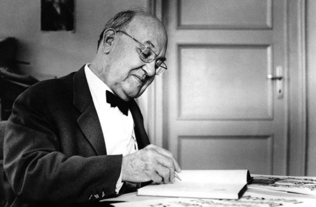
Jan Tschichold as we know him is the man that applied new typography approaches to everyday design problems and explained them to a wide audience of printers, typesetters, and designers. Before the war, he was very hated by the Nazi, being accused of being a cultural Bolshevik, and for creating un-German typography, as said in the Meggs textbook. This German type and book designer revolutionized modern typography through his bold, asymmetrical designs and use of sanserif typography, both inspired by the work of the Bauhaus. The son of a sign painter, Tschichold was born in April of 1902 in Leipzig, Germany. He was trained in calligraphy, which would set him apart from almost all other noteworthy typographers of his time. From strongly advocating the beauty of sans serif fonts and clean, organised design 20 years before it took off, to strengthening the design of Penguin books to turn them into the something special that they are. Jan Tschichold spent a life learning and exploring and left us with much to do the same. His work and expertise paved the way for designers and typographers today in astronomical ways.
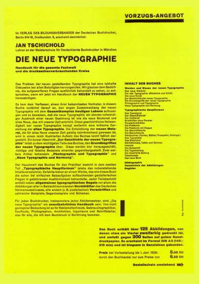
 1914’s Worlds Fair of Books and Graphics was a huge experience for a young Tschichold. He was influenced by studying the books of Edward Johnston and Rudolf von Larisch and their many writings. His interest for old typefaces started to form at this time. He started this at a young age making this feat very impressive. Tschichold had converted to Modernist design principles in 1923 after visiting the first Weimar Bauhaus exhibition. He became a leading advocate of Modernist design: first with an influential 1925 magazine supplement; then a 1927 personal exhibition; then with his most noted work Die neue Typographie.
 Original prospectus for Die Neue Typographie, Jan Tschichold, 1928
Although Die neue Typographie remains a classic, Tschichold slowly abandoned his rigid beliefs from around 1932 onwards as he moved back towards Classicism in print design. He later condemned Die neue Typographie as too extreme. He also went so far as to condemn Modernist design in general as being authoritarian and inherently fascistic. Tschichold became more and more irritated by the typography of the times. He was strongly influenced by modern painters like László Moholy-Nagy and El Lissitzky, whose works used contrasting forms to display balance and conflict. Tschichold believed that the cure for typography lay in abandoning rules, adopting symmetrical setting, and the exclusive use of sans serif typefaces.
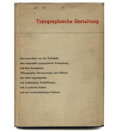
Typographische Gestaltung,Typographic Design, published in English as Asymmetric Typography, 1935
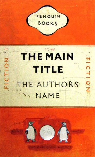
In 1946 he relocated to London at the invitation of Allen Lane of Penguin Books. The three years that followed influenced the design of books for many years to come. At the time Penguin was far from unsuccessful, their now infamous business plan clearly worked. It was their design that was lacking. The biggest task for Tschichold was to establish a set of rules to be used across all books to be published by Penguin. A four page guide was given to all those concerned and covered all things from margins to italics, from punctuation to footnotes, all of which would be housed in a new grid system. This was the base on which Tschichold was to develop the character of each book. Tschichold’s three years at Penguin was nothing short of prolific, resulting in 500 book redesigns. He left at the end of 1949, his design assistant resigning the same day,recommended his successor and wrote out another influential and important chapter in his life and in the history of graphic design.
Penguin Books, Cover Layout
https://www.princeton.edu/~achaney/tmve/wiki100k/docs/Jan_Tschichold.html
http://www.oswego.edu/~coughlin/NC_417/NC_417_project1/pages/page1.html
http://www.linotype.com/794/inhonorofthe100thbirthdayofjantschichold.html
http://www.britannica.com/EBchecked/topic/607663/Jan-Tschichold

