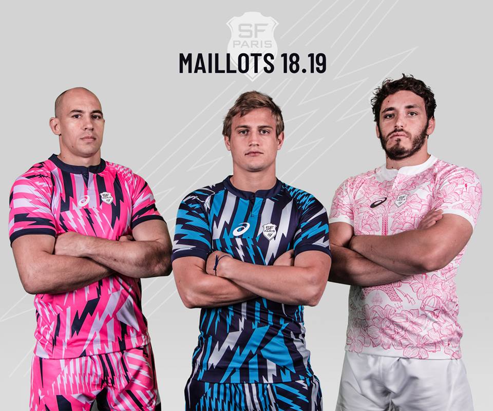
Stade Francais Paris have revealed their brand new home, away and third shirts for 2018/19, which also sport a revamped new logo for the club, as appears to be very much the hot new trend this off-season.
The new home and away shirts are a classic slice of bold, brash and eye-catching Stade Francais craziness, with the pink and dark blue jerseys being covered with myriad contrasting lightning bolts, which also extend to the shorts.
The third shirt is notably different – a white jersey with hand-drawn outlines of myriad Stade-y stuff – lillies, an Eiffel Tower, an old fashioned scrum cap, the odd lightning bolt.

The new club logo, unusually for a club as out there as Stade, isn’t actually that drastic a change – certainly not compared to the Bristol and Gloucester makeovers we’ve seen this year.
In truth it’s very similar to the old crest – the shield is a bit more stylised and has lost the two-tone throwback to the old badge they wore in the 90s, the lightning bolts have been stylised a bit, and the word ‘Paris’ has been brought into the shield itself, in a new font that appears to have been borrowed from Babylon 5.
To us, this new crest unarguably looks worse than the old one – it somehow already looks dated – but given the regularity with which Stade change their branding, we wouldn’t get too worried.
Keep an eye on Rugby Shirt Watch for our full review of the new Stade Francais jerseys from ASICS soon.


