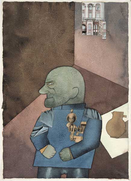
Great Works: Monteur John Heartfield (1920), George Grosz
Museum of Modern Art, New York

For free real time breaking news alerts sent straight to your inbox sign up to our breaking news emails
Sign up to our free breaking news emails
We often think that colour is the most elusive medium. There are a thousand hues, a million hues, and we can never hope to identify them. It is where their mysterious power lies. On the other hand, lines are considered to be most definite elements of art.
But draftsmanship has a palette as large as any colourist. And if we could notice all the possible marks, how many kinds could there be? Well, let's restrict ourselves, for a start, to pure, even and continuous lines – and with no breaks, dots, dashes or vague fades-away.
There are straight lines. That seems clear enough. There are regular curves. There are zigzag lines. There are wavy lines. And these lines sound quite clear, too. Still, you couldn't tell exactly what a "zigzag" line would look like, just from this name. And as for "wavy", this name might mean serpentine or it might mean peaked. The everyday language of line, which seems so simple, is already confusing. And as for the coiled, the looped, the curly, the tangled, the doodled, the scribbled... well, these lines could lead anywhere.
We might want a more technical language. And in fact such a language does exist. There is the traditional code of heraldry, offering a wide range of lines, each one defining a fixed contour. These could be helpful: nebuly (cloudy), dentilly (saw tooth), rayonny (sun rays), ingrailed (thought-bubble), invected (toast bite) etc. They have the advantage of precision. On the other hand, this code also gets pointless rather quickly, because it names many lines we hardly ever deal with.
Besides, why should such terminology be needed? Is there any useful precision in the field of draftsmanship, given that real lines are often infinitely elusive? Yes. It would be handy to recognise a large and definite repertoire of lines – just so long as, at the same time, we should recognise that freely drawn lines are something else. No lines are without basic character. All lines have particular identities, which support the strength of a drawing. For example, try the very emphatic lines used in this image by George Grosz.
This picture is itself a portrait. It is named for Monteur John Heartfield, after his colleague, the communist collage artist. "Monteur" means "engineer", as opposed to fine artist. Pieces of collage are added to this scene. Heartfield is shown imprisoned for his resistance to war service, in a bare cell. But in fact the likeness itself is not Heartfield. This portrait is recognisably Grosz's own head. And this work shows the typical power of his penmanship.
Ignore the elements of collage, and the watercolour too. This drawing is composed of very few and clear and regular ink lines. Some of them are rule-straight – like his lips. Some of them are nearly compass-curved – like his brow. And beyond that, these lines are steered around very slow spirals or bending graphs. The outlines are hand-drawn, but they insist upon the rigid forms.
These strict edges are metaphors too. This portrait as an engineer is declared by his quasi-geometrical lines; his body is made by his engineering tools and templates. More than that, its linear character matches the hard and heartless motives of this figure. His face is set, and his head is a bullet. His hands, though, are less mechanical, more pudgy and feral. They are rough scatterings of hair over his chin, crown and fists. But this is only a minor bit of personality.
So this is a drawing with very deliberate and limited resources. In the repertoire here, there is nothing wavy, nothing zigzag, nothing loopy, nothing tangled. Grosz's drawing is supported by only two named elements, and it's important to identify them: the straight and the curved. It's true that these lines have a slight freedom, but there is very little fluctuation in these very cool, hard, taut, definite lines. This is what gives the force of this picture. Or partly.
For this is a further thing. It can be almost invisible, but it is the crucial effect. His drawn lines are in fact not simply continuous. At one level they may appear to be even and pure. But at another, closer level you can see that each line is made out of tiny broken pen scratches, overlapping, like barbed wires.
Violence enters into this subliminal draughtsmanship. Go round the outline of the bonce, for instance. It may need an examining eye or a magnifying glass, but it has a graphic presence. It's what makes this tension felt, between the cool and the cut. So this is a different register of edge: it's a kind of twofold line, both continuous and broken. A new wider palette is needed.
ABOUT THE ARTIST
George Grosz (1893-1959) was a rare case of a great crossover - like Daumier and Toulouse-Lautrec, both illustrator and artist. He Anglicized his name during the First World War, as an anti-patriotic gesture. He drew savage caricatures of Berlin society, scenes of sex and greed and violence, in his cutting ink-line. He joined the Berlin artistic avant-garde, with sharp collage and furious apocalyptic paintings. He was a big lefty. But his years of genius were brief: all over by the early Twenties. His later work, in Germany, and then in America in exile from Hitler, gets more and more sloppy.
Subscribe to Independent Premium to bookmark this article
Want to bookmark your favourite articles and stories to read or reference later? Start your Independent Premium subscription today.
Join our commenting forum
Join thought-provoking conversations, follow other Independent readers and see their replies