How to Create a Kaplan-Meier Curve in Power BI
Jay Karimi, MBA
I provide mid-sized and large-sized organizations with project-based accounting and finance solutions. 🎯 🚀 Let's talk > message me 💬
Introduction
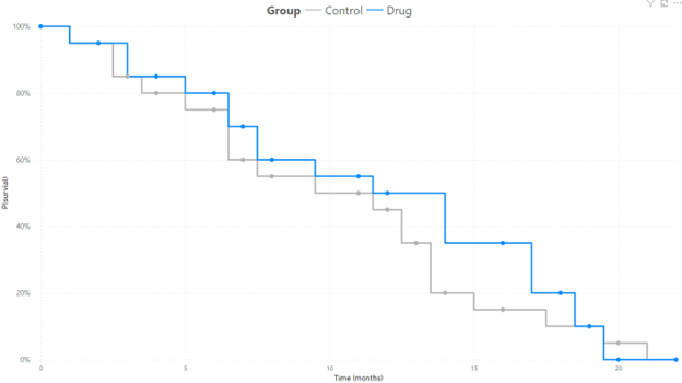
The Kaplan-Meier (KM) curve is a powerful visualization tool that represents the probability of an event occurring at a specific time. Widely used in the biotechnology sector, this curve is instrumental in illustrating the efficacy of a drug, measured through the survival of patients in clinical trials. Beyond biotechnology, it finds applications in various domains, including product life analysis, employee tenure analysis, tracking credit defaults over time, and assessing equipment reliability.
Why Power BI for Kaplan-Meier Curves
Power BI, a leading business intelligence tool, offers a robust platform for creating and visualizing Kaplan-Meier curves. Its interactive features, coupled with dynamic visuals, make it an ideal choice for professionals seeking insightful data representations.
Advantages of Power BI:
Dynamic Exploration: Power BI allows users to interactively explore and drill down into data, making it easier to analyze complex survival patterns.
Real-time Updates: The analysis is kept up-to-date with real-time data integration, ensuring the Kaplan-Meier curves reflect the latest information.
Customization: Power BI provides extensive customization options, allowing users to tailor the visuals, legends, and axes to meet specific needs.
Setting Up Your Kaplan-Meier Curve in Power BI
Step 1: Prepare Your Data
At least three columns are needed to create a Kaplan-Meier curve: time, probability of an outcome, and category. Time will typically be measured in number of weeks, months, or years. It is important to note that unlike other time series, time in the KM curve is discrete as opposed to continuous. It expresses the probability of an event occuring at a particular moment in time. The next column is the probability of the event, which needs to be ranked in descending order by category. It is also a cumulative number such that it begins at 100% at time 0 and will decrease to 0% over a long enough timeline. If the goal is to demonstrate the performance of one product over another, then the final necessary column is category. The category can be a drug in clinical trial versus a control group or it can be company department if the curve is measuring employee tenure.
Here is an example of how the table should be set up:

Step 2: Create a Line Chart
Drag a Line Chart onto the canvas. Configure the chart with time of the X-axis, probability on the Y-axis, and category or group in the Legend.

Step 3: Adjusting the Interpolation
As mentioned earlier, a feature of the KM curve is that time is not treated as a continuous variable. Because the cumulative probability of an event occuring is charted at a particular time, the line type should be changed to 'step'. This setting can be found in the 'Lines' section and 'Shape' subsection under the 'Format your visual' tab in Power BI. This will create the distinctive downward staircase look of the Kaplan-Meier curve.

Conclusion
With the wealth of insights across various industries that the Kaplan-Meier curve in Power BI provides, this should be in the toolbox of all data analysts. The easy to interupt time-to-event visualization allows the viewer of the chart to compare the likelihood of an outcome across multiple scenarios in a single chart.
#KaplanMeier #Dataanalysis #PowerBI #Clinicaltrials #Biotech #Biotechnology