Jealousy
Why Links Between Colors and Emotions May Be Universal
... and the enduring debate over the meaning of red.
Posted February 8, 2022 Reviewed by Abigail Fagan
Key points
- People often link colors and emotions in their languages. For example, “seeing red” means that someone is angry.
- Research shows that people across 30 countries found it easy to link colors and emotions, and those links appeared to be universal.
- People whose languages were more similar to each other had even more similar associations.
In language, we easily link colors and emotions. English speakers see red, feel blue, or are green with envy, meaning they are angry, sad, or envious, respectively. French speakers voient rouge (see red), ont une peur blue (have a blue fear), or ont un rire jaune (have a yellow laugh), meaning they are angry, extremely anxious, or display a forced false laugh. German speakers sehen rot (see red), sind blau (are blue), or werden gelb vor Neid (turn yellow with envy), meaning they are angry, drunk, or envious, respectively. As one can see, some of these color metaphors repeat across languages, while others differ. In some languages, different colors might not only relate to different emotions but signal different intensities of the same emotion. In Lithuanian, the degree of anger is coded through color—as Lithuanian speakers become increasingly outraged, descriptions move from being white of anger, to red, to blue, and finally to black (i.e., pabalę, paraudę, pamėlę, or pajuodę iš pykčio).
The longer we perform our studies in affective color psychology, the more we get asked if such affective color metaphors are related to or are even at the origin of color-emotion associations. Thus, we decided to follow up on this question. Moreover, you can check if color-emotion associations in your language and for your country match the colorful sayings.
The International Color-Emotion Association Survey
To gain insight into color-emotion associations, we are running the broad-reaching and collaborative International Color-Emotion Association Survey (Mohr et al., 2018). If you click on the link, you will hopefully find the translation of the survey in your mother tongue.
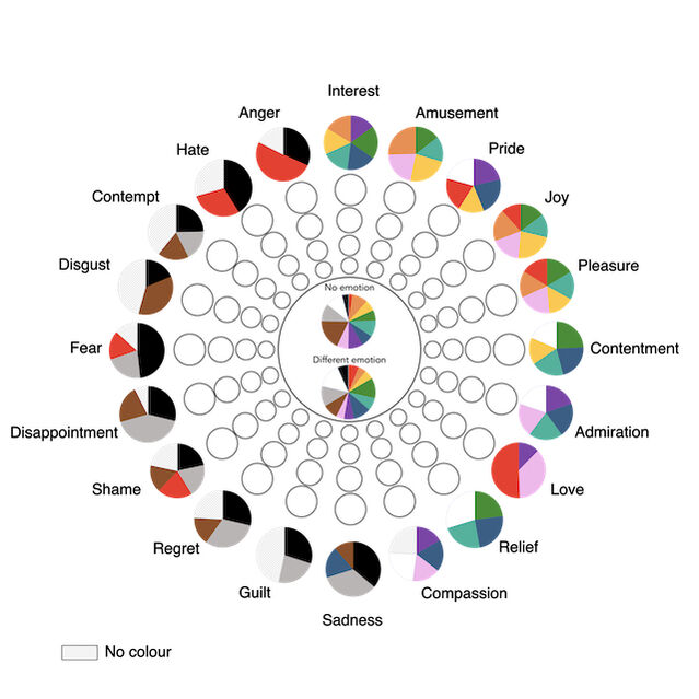
In the survey, participants see 12 color terms (Table 1) and must choose one, several, or none of 20 emotion terms, arranged in the form of a wheel (see Figure 1). Emotion terms appear always at the same location. You probably already noticed some regularities in their arrangement. We will explain all of them, some being more obvious than others. In research, we speak of affective dimensions. The first one is valence, ranging from the most positive to the most negative emotion. On the wheel, you see that similar emotions are placed next to each other with 10 positive emotions being on the right side and 10 negative ones on the left.
Another dimension is affective power, and on the wheel, 10 empowering emotions are located on the upper half, while 10 disempowering and immobilizing emotions are located on the lower half. Finally, there is also arousal. On the wheel, there are 10 emotions that are activating (e.g., fear, amusement), while 10 others are calming (e.g., sadness, contentment). Since the wheel only has two dimensions (left-right and up-down), these emotions are spread around the wheel (Scherer et al., 2013).
What Has the Survey Told Us So Far?
In one of the first publications, we reported the results from 30 countries and over 4,500 participants (Jonauskaite et al., 2020). These countries were located on all the continents but Antarctica. We studied many European countries as well as the U.S., New Zealand, Egypt, Nigeria, Azerbaijan, China, and others. We calculated the proportion of emotions selected per country for each color term and their average intensities.
Here are some major results.
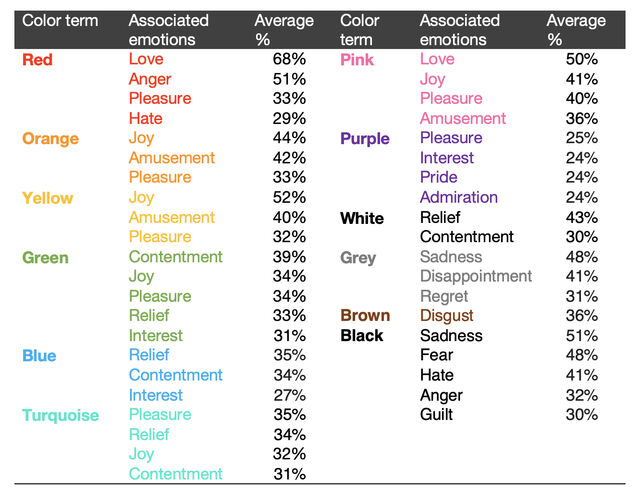
First, all participants found it quite easy to link colors and emotions. This was particularly true for colors like red, black, or yellow. Other colors, like brown and purple, received fewer associations. Check Table 1 if you want to know which colors went with which emotions. We found that color-emotion associations were not one-to-one, but many-to-many. Participants did not select one emotion for a color, but often chose several emotions. In turn, different colors were linked to the same emotion, like pleasure, which was associated with red but also yellow, orange, pink, purple, and turquoise (check also Figure 1).
What you can also see is that most colors were associated with positive emotions. Only brown, grey, and black—that is, darker colors—were associated with negative emotions. Red was the most controversial color in terms of valence. For some, it was a very positive color—the color of passion, love, and desire. For others, it was a negative color—the color of danger, anger, and hate. For even others, it was both positive and negative. What connects all these emotions and ideas is the fact that red is empowering, activating, and strong.
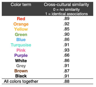
Second, we found few cultural differences. In other words, many color-emotion associations seemed universal. Most participants agreed that pink was associated with love and pleasure, yellow with joy and amusement, or that black was the saddest color. If you look at Table 2, you can see that all colors apart from purple showed a very high agreement across countries.
Third, if you are interested in cultural differences, we found some specificities too. For example, in addition to the universal associations of love and anger with red, Chinese participants also associated joy and amusement, while Nigerian participants additionally associated fear with red. Another example is the association between purple and sadness that only Greek participants chose. For others, purple was generally a positive color with very little agreement on the exact emotions associated with purple (which is reflected in Table 2). We can say that purple was the most controversial color of all!
Fourth, participants whose languages were more similar to each other also had more similar associations. To arrive at this finding, we estimated the degree of linguistic similarity between two languages, which shows how related or unrelated they are. Perhaps, you might think that Spanish and Italian are quite similar, and this is true, because both of these languages belong to the Indo-European family and, within this family, they are part of the same Romanic language group. Other European languages, like English or Russian, are similar to Spanish and Italian because they all belong to the Indo-European language family, but they would have lower similarity scores than Spanish and Italian, because English and Russian do not belong to the Romanic language group. English is a Germanic language and Russian is a Slavic language. And then, languages from different language families, like English and Chinese, would have the lowest similarity scores. If you are keen on getting into the details of these distinctions, you can find the methodology behind the similarity estimations in Jäger’s (2018) article.
Fifth, participants who lived geographically closer also associated colors and emotions more similarly. To arrive at this finding, we took into account geographical distances between two countries in kilometers. To give a concrete example of how geographic distances affect color-emotion associations, we refer to another publication on the association between yellow and joy (Jonauskaite et al., 2019; also read about the study here). We found that many participants who lived in colder and rainier countries thought yellow was a joyful color, but this joyfulness decreased with a decreasing distance to the equator. The closer to the equator participants lived, the less likely they were to say that yellow is associated with joy. In fact, yellow was the most joyful for Finns, Icelanders, and New Zealanders while Egyptians did not agree with this association at all. These differences are likely to be present because of different associations with yellow. While yellow might remind of heat and drought in warm and dry countries like Egypt or Saudi Arabia, in countries like Bangladesh or Colombia, yellow is again the color of joy, as these countries are not only warm but also humid.
What’s Next?
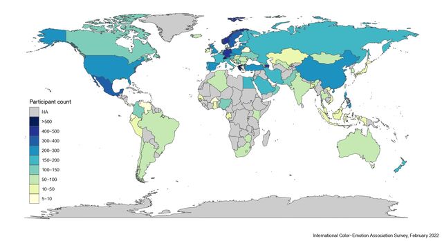
By early 2022, we have extended our data collection further thanks to the help of over 100 local collaborators. We now have data from nearly 90 countries and 12,000 participants (see the map below). The results we showed you here are just the tip of the iceberg and there are thousands of unanswered questions. For instance, we are interested in gender and age differences, as well as looking at cultural variations in greater detail.
We will discuss some of these questions in future posts, so watch this space. If you want to learn more about color psychology already today, feel free to read our earlier posts on chromotherapy or color and personality.
LinkedIn/Facebook image: Anton Mukhin/Shutterstock
References
Jäger, G. (2018). Global-scale phylogenetic linguistic inference from lexical resources. Scientific Data, 5(1), 180189. https://doi.org/10.1038/sdata.2018.189
Jonauskaite, D., Abdel-Khalek, A. M., Abu-Akel, A., Al-Rasheed, A. S., Antonietti, J.-P., Ásgeirsson, Á. G., Atitsogbe, K. A., Barma, M., Barratt, D., Bogushevskaya, V., Bouayed Meziane, M. K., Chamseddine, A., Charernboom, T., Chkonia, E., Ciobanu, T., Corona, V., Creed, A., Dael, N., Daouk, H., … Mohr, C. (2019). The sun is no fun without rain: Physical environments affect how we feel about yellow across 55 countries. Journal of Environmental Psychology, 66, 101350. https://doi.org/10.1016/j.jenvp.2019.101350
Jonauskaite, D., Abu-Akel, A., Dael, N., Oberfeld, D., Abdel-Khalek, A. M., Al-Rasheed, A. S., Antonietti, J.-P., Bogushevskaya, V., Chamseddine, A., Chkonia, E., Corona, V., Fonseca-Pedrero, E., Griber, Y. A., Grimshaw, G., Hasan, A. A., Havelka, J., Hirnstein, M., Karlsson, B. S. A., Laurent, E., … Mohr, C. (2020). Universal Patterns in Color-Emotion Associations Are Further Shaped by Linguistic and Geographic Proximity. Psychological Science, 31(10), 1245–1260. https://doi.org/10.1177/0956797620948810
Mohr, C., Jonauskaite, D., Dan-Glauser, E. S., Uusküla, M., & Dael, N. (2018). Unifying research on colour and emotion: Time for a cross-cultural survey on emotion associations with colour terms. In L. W. MacDonald, C. P. Biggam, & G. V Paramei (Eds.), Progress in colour studies: Cognition, language, and beyond (pp. 209–222). John Benjamins Publishing Company. https://doi.org/10.1075/z.217.11moh
Scherer, K. R., Shuman, V., Fontaine, J. R. J., & Soriano, C. (2013). The GRID meets the Wheel: Assessing emotional feeling via self-report. In J. R. J. Fontaine, K. R. Scherer, & C. Soriano (Eds.), Components of emotional meaning: A sourcebook (pp. 281–298). Oxford University Press. https://doi.org/10.13140/RG.2.1.2694.6406


