
Welcome to Damn Good Design. In this regular series I’ll be cocking a raised eyebrow and flapping my big fat smart mouth at those cars that get fawning prose in glossy coffee table books and those that don’t. We’ll be looking at the bona-fide classics, as well as the overlooked, the underestimated, the misunderstood, the pedestrian and the downright weird. We’ll skewer a few sacred cows and celebrate some utter dross. Nothing is sacred and no car is safe. If has something interesting to offer the history of car design, we’ll discuss it here.
There are three words that were I to have a soul, would be guaranteed to strike fear into the very core of it: A Bold Reimagining. My creative brain immediately translates this as ‘standby for something beloved to be fucked up for the sake of it, in the misguided name of progression because we’re all out of better ideas’. When Matt and I went to see As You Like It by one William “Bill” Shakespeare, it was described as a “bold reimagining.” It didn’t totally work for Matt (theatre is in his blood, darling. I was just trying to keep up) but as works of art plays are perfect for this sort of treatment because they’re often an allegory for the human condition, so are ripe for reinterpretation to reflect contemporary concerns and issues. Operas and classical music subtly change depending on who the performers are. Modern art changes meaning according to the person viewing it. Johnny Cash’s version of Hurt was so different to the original and so successful Trent Reznor was moved to say “it’s Johnny’s song now.”
With design it’s a bit different. Design is a rational, structured process meant to serve a specific brief or purpose – it’s not meant to be interpreted or have meaning placed upon it. Does it have an artistic element? Of course. Good design should aim to be aesthetically pleasing if it’s relevant, especially if outcome that is selling cars. I’ve long said that if design is a scale with pure, function based industrial design at one end and fashion at the other, car design skews towards the latter, but it doesn’t neglect the requirements of building an actual working, sellable vehicle.
Like great art, great design should be timeless. Whether it’s through ideas, appearance, technology or a combination of these, it should transcend the constraints, context and times that created it to become something lasting. Attempting to remix the past for present consumption without understanding any of this is why so many retro car designs end up being superficial, corny or misguided. Which brings us neatly to the recently released Alfa Romeo Tipo 33 Stradale. But before I hands on hips power-piss in the direction of that car, let’s take a look at the original: the 1967 Alfa Romeo Tipo 33 Stradale, designed by Franco Scaglione, and widely considered one of the most beautiful cars of all time.

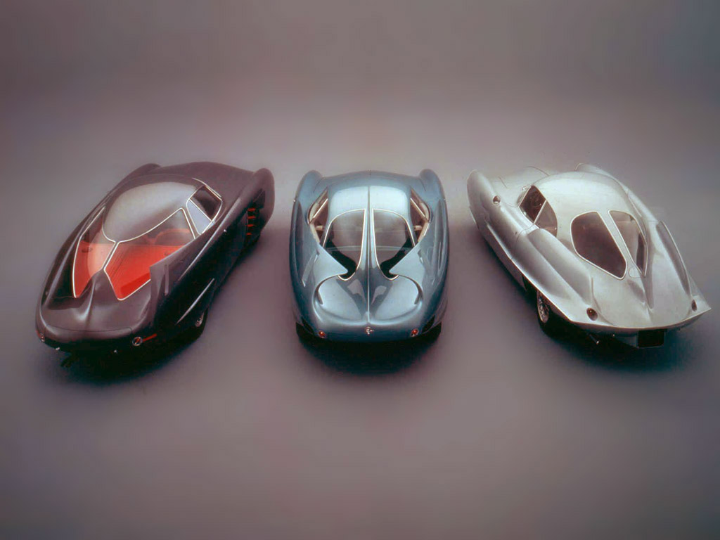
Scaglione’s academic background was aeronautical engineering, but he was much more an artist than engineer. After the war ended he initially found lucrative work sketching for Italian fashion houses, but his real passion was for cars. He cast around looking for work in the carrozzeria surrounding Turin, eventually ending up at Bertone, where he combined his understanding of aerodynamics and eye for a sculpted form in the Alfa Romeo BAT (Berlina Aerodinamica Tecnica) concept cars of 1953 – 55. These were commissioned by Alfa themselves wanting to gain a greater understanding of the effects of drag on road cars.
By the early 1960s, Alfa Romeo was relatively flush with money after the successful introduction of the Tipo 101 Giulietta in 1954, the company’s first real mass-produced car. The Giuletta was successful in European Touring Car racing, but Alfa president Giuseppe Luraghi was thinking bigger. He wanted to get Alfa Romeo noticed globally and decided to take on Porsche and Ferrari in world sports car racing and turned the job over to the in-house racing division, Autodelta.
The first Tipo 33 was not a competition success, but by 1967 Autodelta had evolved it to 33/2 specification, and this racing chassis was to form the basis for the road going version, the Stradale. More recent exotica like the Ferrari F50 or Mercedes AMG One make slightly specious claims about their F1 links. The Tipo 33 Stradale simply was the race car with an extra 100 mm (4”) wheelbase for comfort, and a steel rather than aluminum chassis. Clothed in the slinkiest sheet metal the world had ever seen, the Stradale made the Miura look like the product of a tractor company that it was. The Alfa was half the weight, had half the engine capacity, but was twice as exotic and just as fast – sub six seconds to sixty and over 160 on the Autostrada. Consider the engine: a howling 2.0-liter 32 valve flat plane V8 in the middle of the car with fuel injection, twin spark plugs and four coils, it made between 230 – 240 bhp at nearly 9000 rpm. Why the variation in output? Every Stradale was hand built alongside the race cars over an extended period of time – these were exclusive cars for exclusive customers – and so no two are exactly alike.

Why is the original so good? First of all, it’s relatively tiny. Those dihedral doors weren’t just for show, they were so you could actually get in it. A Stradale stands just 991mm (39”) tall and is only 1710mm (67”) wide. Those delicious Campagnolo wheels are 13” to give you an idea of scale. Viewed in side profile, it’s a masterclass in managing the high point of the bodywork over the wheel arches and maintaining the correct amount of tension in the curvature of the surfaces forming the fenders. The glass to bodyside ratio at the door is 50/50, which means it doesn’t look heavy. There’s the merest hint of forward rake in the stance, allowing the exhaust tips to protrude at the rear, and this helps the body sit lightly on the wheels.
Turning around to the front three quarter view, look how the area over the engine maintains its fullness: this helps balance out the shallowness of the nose, giving the car a touch of front engine proportion even though the motor is in the middle. As I mentioned there’s plenty of glass, but the upward curve of the side windows helps create a taut combined B/C pillar over the rear haunches, which is critical for making a car look properly planted on its wheels.

None of this is a coincidence. Remember Scaglione used to draw fashion which is all about silhouette and volume – making clothes look flattering – so he will have immediately understood how best to cover the fixed points of the racing chassis. The Stradale is so good because it perfectly balances several contradictory characteristics: It’s subtle but aggressive. It’s muscular but also athletic. It’s bleeding edge state of the sixties racing car art and endearingly hand built. It’s lightweight at 700kg (1550lbs – if that doesn’t shut Toecutter up I don’t know what will) but not delicate. These tensions hold it in a perfect center where no one element overpowers another.


18 Stradales were built between 1967 and 1969. A very different looking racing version eventually won the world sportscar championship in 1975, and it remains the iconic car for the brand, as they’ve not really done comparable since. Until now, with the recently unveiled nuova (I guess?) Tipo 33 Stradale. Cue the usual round of internet masturbation and genuflection, to which I have to say, do these people have an actual functioning visual cortex connected to their brains? It’s bloody hideous. It’s fat, it’s overwrought, the detailing is thoughtless and the proportions are terrible.

Let’s start at the side. Remember my earlier remarks about the original when I talked about the high point of the bodywork over the wheel arches? You can see here they’ve been pulled forward on both the front and the rear. There’s nothing necessarily wrong with this, but you have to be very careful. Because the new car has more inflated surfaces this is what starts to make the car look overweight. Not helping is the position of the passenger cabin, which has been pulled forwards and the rear wheels which have been pushed back, increasing the amount of bodywork in the B/C pillar area, increasing the bulk in the middle of the car. Ok, there’s a lot more motor and transmission to package this time around, but moving the A pillar and side glass rear towards the rear would have helped balance it out. The side vent mitigates some of this, but way oh why did they want to make it look like it one continuous part piercing through the rear fender to the back of the car? It’s a cheap visual stunt, the sort of thing stupid people think is clever because they understand it instantly. It doesn’t make any sense because there’s a bloody great rear wheel there, which has got suspension and drivetrain components behind it. It’s dishonest because no way could it work physically.

Looking at the front, I wouldn’t expect the new version to have such a shallow treatment as the original, but this is just a formless meh. There’s no tension in it at all especially over the front wheels. The feature lines heading towards the center of the nose contribute to this flabbiness, because they stretch those upper surfaces across to the middle of the car like a too tight shirt struggling to contain a beer belly. The classic Alfa Romeo shield graphic is given an interesting twist – made up of individual layered elements to create a grille this an excellent detail.


The headlights are much less successful. Lighting graphics are important, and you want to make them distinctive, but the lighting designer didn’t know when to stop. This whole front corner is just lacking in subtlety and the overall graphic reads too big and bottom heavy because it incorporates an intake underneath. Isolatingp the two things would help tighten this area up a lot and stop the front of the car look like it’s flopping towards the ground, something those vertical aero surfaces ahead and behind the front wheels are contributing to. If an area is already looking heavy, don’t add more, take away. Imagine how much better it would look if the black lower bodyside just continued forwards with the profile it has further back.


From the back it looks like it’s been carelessly backed up onto a length of black drainpipe at high speed. I do like the rear light graphics to a point but why the hell is it frowning? You want aggression at the front because that is the cars’ face, not on its butt. The diffuser area and exhausts it so quarter assed it just looks like they ran out of time.


Making all this worse is the interior which is in my opinion, fucking fantastic. The only problem is it’s got somewhat of a seventies vibe to it, with lots of parallel strake patterns giving off a Radiomarelli feel, which by the late sixties was part of the FIAT empire, so maybe that’s where the interior designers got some mood images from? Whatever, it’s warm and inviting, clean and modern. I genuinely love it, even if there’s a slight disconnect thematically with the exterior.
The beauty of the original is its clarity of purpose. It’s unrealistic to expect the new version to be so petit, because of what it has to package, but the point is you work around these limitations to get the shape you want, not let them force you into a shape you don’t want. This new car is available (well not to you or me, they’ve all been sold in advance) as either an ICE or a pure BEV version, in which case what the pissing hams? Talk about hedging your bets. I can’t help but wonder what the split is between the two and how many pure BEV versions they’ve actually sold. Whatever, it will have forced a horrible compromise on the platform. Pick one or the other, or combine both into a hybrid, and get it right. Perfection comes from simplicity.
When I was away in Italy I had one of the best pasta dishes of my life. A simple ragu with spaghetti made fresh in the hotel restaurant from local ingredients. It was amazing. The new 33 Stradale is like getting hit in the face with several overcooked varieties of pasta all at once.
All other images courtesy of Alfa Romeo Media

- We Need To Talk About These Alfa Romeo Taillights That Look Like Jeeps
- The Reborn Alfa Romeo 33 Stradale Is A Refreshingly Pretty 207-MPH Supercar Tribute
- The 2024 Alfa Romeo Giulia Quadrifoglio And Stelvio Quadrifoglio Celebrate An Important Anniversary With Fancy Matrix Headlights And A Cool New Differential
- I Drove Alfa Romeo’s Worst Car Ever And It Wasn’t Really That Bad

“The sort of thing stupid people think is clever because they understand it instantly”.
Christ, if I ever have some punches in need of a pull I know who NOT to call.
ok ok, I know I’m late. I was on vacation and it seemed rude to read my phone while enjoying a Paloma across the table from my boyfriend. First, as always, I love Adrian and I’m so glad to see this article, as I had the exact same thought as soon as I saw the unveil- and I have zero attachment or memory of the original, aside from passing glances at it online. Second, the gall to call out a single commenter on a site getting millions of clicks a month is EXACTLY what makes this site. Most people have no clue who toecutter is (sorry bub) or any understanding of the reference, but it’s deeply funny for those who do. Lil autopian iceberg forming.
Also my new goal in life is to get blasted by Adrian in an article. Gotta go find an impossible hill to die on, I suppose.
Just start being a contrary pain in the ass in comments. I’ll get you eventually.
Is that all it takes?! My wife would tell you I am a walking contrary pain in the ass.
I agree the old one looks great,but there is just something about the proportions that makes it a bit weird. I think it’s the way the thing sits on its wheels or something.
Thanks Adrian, for your analysis.
I see what I think I like and dislike and rarely understand why.
I thought the original was great and had the Italian flair that was missing from say the contemporary Porsche Carrera 6. Race cars bring honesty to the picture.
Now the makeover sequel tries too “computer blended hard”. It is disrepectful.
It should have been a new car worthy of standing on its own, not a “New Stradale”.
Bold reimagining CAN work. The 2003 Battlestar Galactica comes to mind vs. the embarrassingly campy awful 1978 original. I was young enough and loved sci fi enough to have enjoyed that original ’78 series when it was first broadcast only to cringe when I caught a rerun of an episode as an adult. I loved the 2003 version though.
Eh that’s all I got. Just because bold reimagining CAN work doesn’t mean success is common.
“Johnny Cash’s version of Hurt was so different to the original and so successful Trent Reznor was moved to say “it’s Johnny’s song now.”
I also liked Social Distortion’s cover of “Ring of Fire”.
2003 BSG remains one of the greatest TV series I’ve ever seen, even if it did go off the rails a bit toward the end.
Have you seen “The Americans”? It had a good ensemble of mint condition 80’s cars.
https://www.imcdb.org/m2149175.html
Impressive review, much better than I expected after your flippant doggydo remark last week. Can’t fault your analysis, and agree with the ramjet being silly nonsense, but also see it as having fun with it, and imbuing batmobile vibe. Considering that these are sold out to the exceptionally frivolous, I think they hit their mark. Surely a goth understands wanting to be batman.
Your high points diagrams don’t make much sense to me. Going at the pictures with a straight edge, I’m not finding the high points in the same location you’ve drawn lines through. On the old one, your lines are close enough not to quibble, but on the new, the high points definitely appear to be aft of your lines.
But I don’t think that’s even the key difference in the fenders.
What I do see on the old design that you didn’t mention is the wonderfully asymmetrical wheel wells. The asymmetry is especially visible in the rear wheel arch. These work especially well with the forward-leaning rocker panel line. In the direct side view, these details work together to suggest that the car is an alert and crouching feline. It’s a subtle point that makes a big change to the personality of the car.
In defense of Adrian, I would guess that when he’s talking about “high points,” he’s really talking about the tension point in the line, not where the line is the highest off the ground. A subtle but important distinction.
I think I’m an artful engineer, but I’m definitely more engineer than artist. If what you say is true, then a better explanation in the article would’ve been very helpful.
Still, those sexy wheel arches! Not a mention…
(preface: i’ve only ever seen photographs or video.)
counter-example: the 2012 disco volante coupe was a huge aesthetic improvement over the original c52 coupe, which looked like what Marvin the Martin would try to drive after too many mescals. the c52 spider was passable however.
Oof, as someone who hates a lot of the “bold reimaginings” of classic theatre, I’m gonna say this might be true in theory, not always so much in fact. Forcing a story reflecting society at a given point in time to also serve another significantly different point in time is often a square-peg-round-hole problem.
Even if you can successfully adapt a story to suit your needs, living up to a true classic is almost impossible. I’m going to take the probably controversial stance that Hurt was a good candidate for reimagining precisely because it was popular but wasn’t a classic and so left room for someone to match or exceed it. I’m not sure you can say that about Shakespeare. Or, to bring it back to the topic of this article, the original Alfa.
To further digress, I’m often surprised by which artists I prefer covers of. There are songs by some of the biggest names in the music industry whose songs I actually like better when done by someone else. Then there are artists who are dismissed as bubblegum pop or whatever, but I still prefer their renditions to any cover I’ve found. It will be interesting to see how history judges the current state of the music industry.
Man, I have a LIST of covers that were better than the originals. Off the top of my head:
Only Love Can Break Your Heart – St Etienne
Dear Prudence – Siousxie and the Banshees
Always on My Mind – Pet Shop Boys
More Than This – 10000 Maniacs
Ziggy Stardust – Bauhaus
and now, an opposing viewpoint:
I appreciate the passion for the original, which is yes one sexy thing. Compare the new one to the old, of course, there really isn’t a comparison.
Let’s say, though, that I had no knowledge of the ’67. Because I didn’t, because this isn’t my wheelhouse. I’m looking at the new one simply of its own merits. It isn’t the ’67, no, but as a thing, I think it looks exciting. I would be damn proud to be seen in it.
Your passion, while admirable, is also incorrect. Enjoy it for what it is, and what it isn’t. It’s not a fucking Jeep Patriot.
It’s not passion, it’s the expertise of a professional car designer.
That was an amazing analysis. I liked the New Tipo the first time I saw it, but like waking up to a girl you met in a dark club after a bunch of beers, now I can’t bare to look at it.
What my old boss used to call a two bagger. One on your head in case hers falls off.
Or the extreme tripple bagger; one for the dog so it doesn’t start barking if the primary bag falls off.
Ah, you mean a stumper, where when you wake up in the morning and she’s lying on your arm, you’d rather chew through it and leave a stump……
I’m a bit late to the party but I’m still happy I arrived at all. Sisters Of Mercy is playing over the speakers and Uncle Adrian is systematically tearing a disastrous design apart. I very much agree that this car is unattractive and frankly I think that the majority of retro modern designs over the last 25 years have been abject failures.
I’ll concede that the Challenger is a very successful example of a modern car that stays true to retro design elements without feeling overwrought…but can we think of any others? The first gen S197 has aged like milk. The SSR is a meme. The Prowler is arguably more famous for being underpowered and having the wrong transmission than it is for its design.
What else comes to mind? My general conclusion is that old designs should be left alone because of how impossible they are to replicate due to modern safety regulations, but I’d love to hear an argument to the contrary if anyone has one. Oh and I guess personally like the modern Countach, which fits this bill, but I understand that most folks aren’t that fond of it.
I think the ca. 2000 Ford GT is a tremendous reimagining. That may just be the exception that proves your rule, though.
The Camaro isn’t bad, much like the challenger.
I don’t share your hate for the prowler and the SSR (except the convertible SSR, Gag me). But clearly they are no masterpieces.
But hey, let’s talk PT Cruizer. barf.
All SSRs are convertibles, my friend. But yes, the Ford GT is a great example. That car is gorgeous and is an absolute beast, although after watching James from Throttle House come within inches of totaling one when he was lapping I’m not sure if I’d jump at the opportunity to drive one.
Most of the last generation of analog supercars are widow makers…and while it adds to the mystique I’m not sure if I’d trust my own abilities to handle one. I also happen to think that the 5th gen Camaro is aging pretty poorly. The rear end is a bulbous disaster and the lower trim ones just look…old from the front, and not in a good way.
Many of them have reached their hooptie stage, at least in my area, which is probably clouding my judgment. But outside of the ZL1 they don’t look very good to me anymore. It’s sacrilege to say this in Camaro circles but I actually think the final iteration of the 6th gen is the most attractive modern Camaro. They softened the edges in all the right places and finally figured out attractive taillights, particularly when you opt for the gray ones. It’s a damn shame you can’t see out of them…they’re attractive and great driving cars.
> All SSRs are convertibles, my friend.
In the name of all that is holy, what the actual fuck were they “thinking”?
The Challenger looks pretty good until you see one parked next to an E-body and realise what an obese brick it is. The original Challenger is boxy, sure, but there’s actually a lot of subtle curves to it. It’s like the difference between Elizabeth Taylor and a Minecraft skin of ET.
The Challenger is minor modern masterpiece. I’ve written about why it’s so good previously:
https://www.hagerty.com/media/opinion/vision-thing-challenger-once-more/