The exhibition at the De La Warr Pavilion in Bexhill-on-Sea, the first retrospective of Willem Sandberg’s work in the UK, may go some way to solving the one big Sandberg problem – the fact that not very many gallery visitors have ever heard of him. Sandberg lived a long life, from 1897 to 1984, and he was prolific to the end. He was a graphic designer, a pioneering museum curator and director at the Stedelijk Museum in Amsterdam, a champion of modern art and artists, and an original thinker. He rejected the formal and reverential in favour of the playful, daring and disruptive. With little formal training, he learned almost everything he knew from experience and experiment.
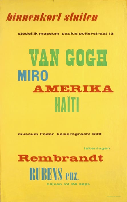
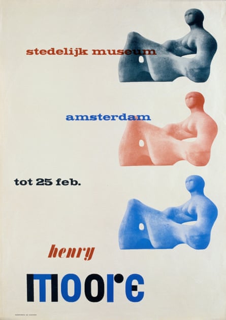
The show concentrates on his posters and catalogues, and once you see them you will never mistake his work for anyone else’s. He chose off-centre positioning, rough hand-torn paper montage, a collision of sans serif fonts and old Egyptian type, and almost always a bit of red ink somewhere. The names of modern artists flew across the page, as famous as matinee idols, which was slightly shocking in the 1940s. Sandberg composed his own manifesto in verse form:
i believe
in warm printing…
… I don’t like
luxury in typography
the use of gold
or brilliant paper
i prefer the rough
in contour and surface
torn forms
and wrapping paper
The wrapping paper ethic arose through circumstance. As a child of two world wars, Sandberg’s best work emerged through a culture of austerity and need; he recycled material and images whenever he could, and his influences, not least Dada and Bauhaus, infused his mischievous and modernist outlook. His catalogues resembled punk fanzines 30 years before punk, and, if his work sometimes appeared roughshod and haphazard, one should remember that it took immense devotion to get it to look as accidental as it did.

“This is printed on wallpaper, very asymmetric … an amazing thing really,” Fraser Muggeridge, the curator, says as he shows me his collection of Sandberg ephemera in his studio in London’s Smithfield. It is a space Sandberg would have admired, with its display of promotional work for emerging artists and galleries crowding in from the walls. “I don’t think he was trying to make the most perfect work, but it was always free-spirited and arresting.” His letters were highly sculptural, revealing negative space; at first glance a torn “T” becomes a sideways “E”. They speak of his obsession not only with making intricate objects by hand, but also with solid branding: his graphics for the Stedelijk created a look and mood for a museum that today would require a huge budget and corporate pitching.
Astonishingly, most of Sandberg’s catalogues and posters were a sideline, designed in the evenings and at weekends. Sandberg was the director of the museum from 1945 to 1962, and his close relationship with the local state printer produced an identity that transformed the Stedelijk into one of Europe’s first truly modern galleries. He created what he liked to refer to as an “Anti-Museum”, rejecting the traditional dark and hushed rooms and creating something bright and accessible, a place of social interaction. He championed young artists, and he succeeded in attracting people who had barely set foot in a museum before. There was a shop, a learning centre and a cafe, all brave innovations in the middle of the century. As was Sandberg’s scheme to get the Stedelijk a little more noticed in the city: he painted the entire building white. It was Tate Modern before Tate Modern, but even Nick Serota doesn’t design most of the empire’s promotional material.
Sandberg oversaw the first exhibitions of several American and European artists, and bought stars of the future at bargain prices: he promoted Picasso and Pollock, and spent just a few hundred guilder on early work by Kandinsky, Mondrian and Schwitters. He spoke of how he was primarily interested in an artist’s character; only through character could he determine whether they would make great things in the future or retreat into repetition. His directorial skills were recognised internationally. After retirement from the Stedelijk, Sandberg spent several years in the mid-60s establishing the Israel Museum in Jerusalem, and he was on the design committee for the Pompidou Centre in Paris when it appointed architects Richard Rodgers, Renzo Piano and Gianfranco Franchini in 1971. The “inside-out” exhilaration of the building may have echoed in Sandberg’s head: some years earlier he had commissioned a long, high external ramp to run along the glass windows of the Stedelijk, so that those who believed they had no interest in the exhibition inside could take a peek nonetheless, and without paying.

And now, some of Sandberg’s best work has made it to the 1930s modernist palace that is the De La Warr Pavilion on the shingled East Sussex coast. When I visited a few days ago, the bulk of the material was still emerging from crates. The first posters were lined up against long walls, while central vitrines contained hand-made New Year cards and correspondence with British friends Henry Moore, the ICA and the typographer Herbert Spencer. At the helm was Carolien Glazenburg, the curator at the Stedelijk.
Glazenburg serves as Sandberg’s most eloquent guardian. She has been at the museum for more than 30 years, and regrets not getting to know Sandberg better when she had the chance. But she has caught up on his turbulent history since, and it’s a formative tale. During the Nazi occupation his talents were put to use as a forger. With a group of others in the resistance he made fake ID cards, and the fact that the Germans found them difficult to detect was to Sandberg “the greatest praise I have ever had for typographical work”. But there was one place where the false papers could be exposed, and so in 1943 Sandberg’s group attempted to burn down the Central Civil Registry Office. The plot was only partially successful, and many conspirators were rounded up and shot. Sandberg escaped, spending more than a year in rural hiding in the guise of a painter. “When he returned to the Stedelijk after the war,” Glazenburg says, “he said that nothing that came after it could ever frighten him.”
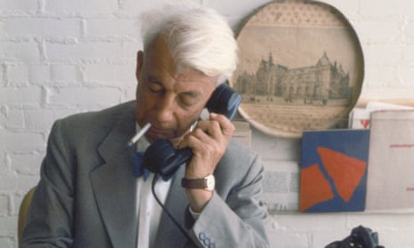
The visitor to the new show is greeted by a large photo of Sandberg seated in his office at the height of his indie-pomp in 1960. He has his signature look: white mop of hair and bow-tie, inquisitive eyebrows, busy on the phone, cigarette in mouth, pen in hand. He looked cool in an era before gallerists had to look that way. Most of his staff adored him, and he ran the museum on socialist principles, with all staff tips being put towards an annual artistic jolly somewhere in Europe, cleaners and management on the same bus.
Sandberg was fortunate that he operated in a liberal postwar atmosphere where his wilder enthusiasms were tolerated by civic authorities. He rarely sought permission to put up his advertising signs in the city, and he encouraged the same freedoms in the artists he displayed. Show him a barrier and he would try to slip past it. His questioning of the status quo extended to the smallest detail. Why, he asked his students on a course he gave at Harvard in 1969, should one not address an envelope the way the postal system reads it: country first, then the town and street, and then the number and the name of the recipient?
Predictably, young people loved him more than the establishment, and he railed against the conservative critic. “In general a review arises like this,” he once told an interviewer. “The critic begins to write in the vein of, ‘On such and such a date we had a previous exhibition by this man and this new exhibition is much poorer than the former one’, and that’s about it. They can then construct all sorts of literary stories around it and refer to just about anything, but it’s actually more about their judgments than providing background against which you can understand the artist.”
![Open Eye [open oog], magazine, 1946. Courtesy Stedeiljk Museum Amsterdam](https://i.guim.co.uk/img/media/80d0ec74fe9fb4561a81d210f91a2494441065a6/199_82_2370_3212/master/2370.jpg?width=445&dpr=1&s=none)
Glazenburg has constructed a plan of her exhibits on large yellow sheets taped together, something Sandberg would probably have done himself. “He slept for only four hours a night,” she says, but viewing the range of material one wonders that he ever slept at all (and one tends to feel for his wives; he was twice married with children). Sandberg estimated that he made 320 catalogues and 150 posters, but the archive now numbers 310 and 380. About a quarter of his output will be on show at Bexhill, and a quarter is enough: not all of his work was spectacular, and a brand can soon become overfamiliar. But there is no mistaking the joy in his work, and also its progression. As his confidence and influence grew, he moved from type to image, pushing towards abstraction just as the general trend in type moved towards regimentation. Impact trumped legibility. He wanted to ensnare with letterforms and colour, a toyshop window promising delights within.
Sandberg died in the same year the Apple Macintosh was born, and one can only surmise what he would have made of one. I imagine he would have extended its possibilities while rejecting its uniformity. “Creativity is / the capacity to shape life / as it grows underneath the surface,” he wrote in one of his verse notes in 1967. He liked the roots of things, and a bit of raggedness, and he wanted people to look at things with wide eyes. His approach to the visual arts was matched by his embrace of the arts in general – warm and tactile, a bit of a challenge, something for the soul. He wasn’t a Helvetica man, and he probably wouldn’t have been much of an app man, though he always sought newness. And he achieved his most explicit goal, “to stimulate the communication between artist and public”. If this seems modest and commonplace today, we should remember that Sandberg was among the earliest to make it so.
- Willem Sandberg: From Type to Image is at the De La Warr Pavilion, Bexhill-on-Sea, until 4 September. dlwp.com/event/willem-sandberg.

Comments (…)
Sign in or create your Guardian account to join the discussion