Kaplan-Meier Survival Analysis - GraphPad Software
Kaplan-Meier Survival Analysis - GraphPad Software
Kaplan-Meier Survival Analysis - GraphPad Software
- No tags were found...

Create successful ePaper yourself
Turn your PDF publications into a flip-book with our unique Google optimized e-Paper software.
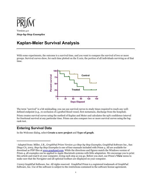
Version 4.0Step-by-Step Examples<strong>Kaplan</strong>-<strong>Meier</strong> <strong>Survival</strong> <strong>Analysis</strong> 1With some experiments, the outcome is a survival time, and you want to compare the survival of two or moregroups. <strong>Survival</strong> curves show, for each time plotted on the X axis, the portion of all individuals surviving as of thattime.100Percent survival755025TreatedControl00 30 60 90 120 150Days ElapsedThe term "survival" is a bit misleading; you can use survival curves to study times required to reach any welldefinedendpoint (e.g., re-occlusion of a grafted blood vessel, first metastasis, discharge from the hospital).Prism creates survival curves using the method of <strong>Kaplan</strong> and <strong>Meier</strong> and calculates the 95% confidence intervalfor fractional survival at any particular time. Prism can also compare two or more survival curves using the logranktest.Entering <strong>Survival</strong> DataIn the Welcome dialog, select Create a new project and Type of graph.1 Adapted from: Miller, J.R., <strong>GraphPad</strong> Prism Version 4.0 Step-by-Step Examples, <strong>GraphPad</strong> <strong>Software</strong> Inc., SanDiego CA, 2003. Step-by-Step Examples is one of four manuals included with Prism 4. All are available fordownload as PDF files at www.graphpad.com. While the directions and figures match the Windows version ofPrism 4, all examples can be applied to Apple Macintosh systems with little adaptation. We encourage you to printthis article and read it at your computer, trying each step as you go. Before you start, use Prism’s View menu tomake sure that the Navigator and all optional toolbars are displayed on your computer.©2003 <strong>GraphPad</strong> <strong>Software</strong>, Inc. All rights reserved. <strong>GraphPad</strong> Prism is a registered trademark of <strong>GraphPad</strong><strong>Software</strong>, Inc. Use of the software is subject to the restrictions contained in the software license agreement.1
Select the <strong>Survival</strong> tab. Prism displays the possible graph types for survival analysis. As you click on thethumbnail views, you can read a Selected graph description for each below. For this example, we’ll create adescending staircase graph with tick marks showing censored data and with no error bars. Therefore, select thetop-left thumbnail view. Near the bottom of the dialog, choose to express the Y values as the Percents of subjectssurviving at the designated times. Here are the selections:Before leaving the Welcome dialog, note the instructions for data entry provided at the bottom. When you clickOK, Prism displays the formatted data table.For each subject in the study, enter the survival data as follows:1. In the X column, enter the time elapsed (e.g., days, months) between entry of a subject into the study andthe time of the "outcome" for that subject. You must enter a specific number of days (or other units oftime), not a range of dates.2. In the Y column, enter the binary code value specifying the outcome for the subject on that row. Bydefault, the value "1" denotes occurrence of your designated experimental outcome (death or otherspecified endpoint), and the value "0" denotes that the subject was censored. Unless you change thisdefault (see “ Changing the <strong>Analysis</strong>”, page 5), the only permissible values are 0 and 1. A subject iscensored when you have no useful information about what happened to the subject after that time.Subjects alive at the end of the study are censored, because you do not know about their later survival.Subjects who leave the study are also censored, either because you do not know whether or not theysurvived, or because you can't use that information because they were no longer following the studyprotocol.If you need to record two or more outcomes at the same time, use multiple rows with the same X value. Here isour example data:2
<strong>Survival</strong> DataFor this example transplant study, we'll describe just the Control data in column A. Subjects in the Control group died (code= 1) at 46, 78, and 124 days after transplant. One subject in the Control group was lost to follow-up (code = 0) 46 days aftertreatment, and another was dropped for noncompliance (code = 0) 64 days after treatment. At the end of the study, threesubjects were still alive and enrolled in the study; one had survived for 130 days, and the other for 150 days, after treatment.You don't have to enter X values in order of occurrence. In fact, if it is more convenient, you can enter all of yourdata for a particular treatment group together, as shown in the following table. Just be sure to match each eventcode (Y-column entry) to its proper time (X-column entry).3
Data Vertically Ordered by GroupAll the data for the Control group are entered first (rows 1-8), followed by the data for the Treated group.Before proceeding, make sure that each subject in your study is represented exactly once (by either 1 or 0) in the Ydata column. In other words, the total number of 1's and 0's entered in each column should equal the number ofsubjects in that group.Automatic <strong>Analysis</strong> and GraphingSince it has been given all the information it needs in the Welcome dialog, Prism performs the survival analysisand graphs the survival curve automatically. Click the yellow Results tab on the toolbar. Prism displays theresults on a Results page, which shows the coordinates for plotting percent survival vs time. You can see furtherresults by clicking on any of four subsheets in the Navigator: <strong>Survival</strong> proportions, showing fractional survivalat each plotted time; # of subjects at risk, number of subjects still alive up until each time point; Curvecomparison using the logrank test; or Data summary.Click on the yellow Graphs tab to view the survival graph. The following illustration includes some formattingchanges not discussed here:100Percent survival755025TreatedControl00 30 60 90 120 150Days Elapsed4
Changing the <strong>Analysis</strong>If the survival analysis is not configured as you wish, click Change… <strong>Analysis</strong> Parameters….The Input frame of the resulting parameters dialog shows the default binary coding for experimental outcomes—“1” indicating death or other specified endpoint, "0" indicating censored data. You may substitute other codenumbers (but not letters) here.In the Output frame, you can change how the survival data are graphed—whether Y coordinates indicatefractions or percentages, whether the graph shows survival (descending from 1.0 or 100%) or deaths (increasingfrom 0), etc. The output parameters were originally chosen when you selected the graph type, in fact, another wayof changing these parameters is to choose Change… Graph type….5