The Most Controversial Horror Movie Posters
- Photo: Hoyts Distribution
Dying Breed was a movie inspired by the Sweeney Todd-esque Alexander Pearce, a cannibalistic individual who baked “meat” pies for a living before being deported to a penal colony in Tasmania.
The poster featured a pie sliced open with all the gut-wrenching contents pouring out. The poster itself didn’t receive a ban in every public domain, just bus shelter advertising. It’s definitely the last thing you want to see before boarding the bus to work in the morning, although perhaps it did deter people from bringing hot food onto public transport... Silver linings.
- Photo: Lionsgate
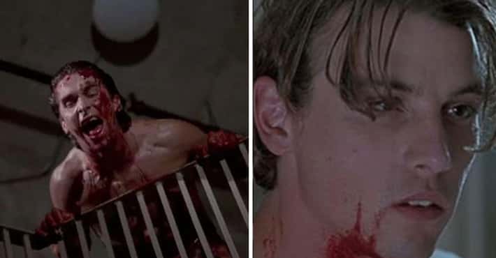
This one is a double threat, in every sense of the word. Eli Roth’s Hostel Part II certainly raised the bar in terms of graphic torture, and the posters certainly let viewers know what the film had in store.
Not subtle in the slightest, the sequel's first poster featured hunks of torn-up, congealed flesh - a very provocative image to say the least. However, the brainchild of the campaign, Tim Palen, knew exactly what he was doing, and the poster made it past the MPAA. How? Well, the “flesh” was nothing more than close-ups of boar meat cuts, and once Palen provided the receipts from the butchers, they were good to go. The second poster was a variation of this, only it was accompanied by what seemed to be actor Bijou Phillips's decapitated head, just to turn the creep factor up a notch.
Although the poster made it past the MPAA, it actually ended up being rejected by the Century/Cinemark cinema chain, which instructed its staff not to hang it up, citing it as “ruthless.” The replacement instead features one of the movie's victims restrained and hanging upside-down, which (for those who have seen the movie) is arguably even more unsettling.
More Hostel: Part II
- Dig Deeper...List of All Movies Released in 2007
- #98 of 139 onThe Best Movies Of 2007
- #46 of 117 onThe Best Horror Movie Sequels
- Photo: Roadside Attractions
For those who aren’t aware, Teeth is a darkly comedic, somewhat sweet horror film featuring a high schooler who promotes abstinence. After coming into womanhood, she soon begins to realize she is in fact cursed with “vagina dentata,” which, in short, means her nether regions are equipped with razor-sharp teeth and will pretty much take care of anyone who tries to break her vow... especially males.
The original poster that was conceived (but never actually released, as it was banned immediately) featured an X-ray that - although it communicated exactly what the title meant - definitely didn’t leave much to the imagination.
The new poster featured our leading lady in a bath with a razor-teethed rose underwater exactly where her nether regions would be. This still seems a bit on the nose, but perhaps it was just enough to get past the censors.
A rendition of the original X-ray cover can still be found on some special-edition DVD covers, only with the chompers now being integrated into the Teeth title.
More Teeth- Dig Deeper...List of All Dark Comedy Movies
- And Deeper...List of All Movies Released in 2007
- #330 of 396 onThe Best Horror Movies Of All Time
- Photo: Lionsgate
Captivity (2007) features victims in a Saw-like setting, and much like Saw’s promotional ads, Captivity's billboards featured the brutality that audiences could expect from the movie.
The poster - which was independently put together by Captivity's production company, After Dark - showed four sections titled ABDUCTION, CONFINEMENT, TORTURE, and TERMINATION. The problem with this particular promotion was that each photo depicted exactly what the title described. It wasn’t long before members of the public began to complain, and the billboards were immediately removed.
The new poster simply featured the leading lady in a confined tank, buried in sand. While this still looked pretty bleak, it definitely wasn't as graphic as its predecessor.
More Captivity- Dig Deeper...List of All Movies Released in 2007
- #174 of 178 onThe Best Lions Gate Entertainment Movies List
- #11 of 18 onThe Best Russian Horror Movies
- Photo: Anchor Bay Entertainment
Much like the 1978 original, 2010’s I Spit on Your Grave follows the story of a woman who seeks revenge after being sexually assaulted. The remake also had an almost-identical poster to that of its predecessor, featuring the back of the leading lady in torn underwear, wielding a knife.
Regardless of the poster paying homage to the original, the MPAA felt it sexualized violent assault. Its replacement featured the exact same image, only it was edited to give the woman more coverage.
More I Spit on Your Grave- Dig Deeper...Movies Distributed by Anchor Bay Entertainment
- #22 of 64 onThe Best Horror Movie Remakes Of All Time
- #221 of 396 onThe Best Horror Movies Of All Time
- Photo: Momentum Pictures
Lesbian Vampire Killers started its advertisement in the tubes of the London Underground. Surprisingly, this poster didn’t offend because of its raunchy imagery but because of the movie’s title itself. Not long after marketing began, complaints starting flying in. CBS Outdoor, who run the ad campaigns for UK transport, cited:
The film title is linked to horror, sexuality and violence which as a combination are felt to be inappropriate ... to be viewed by all ages on the transport system.
Due to the sexually suggestive title, the poster had no choice but to be pulled completely.
- Dig Deeper...List of 100+ Parody/Spoof Movies
- And Deeper...Famous Movies From England
- #53 of 66 onThe Best 2000s Vampire Movies
- Photo: Lions Gate Films
Those who have seen the gory, torture-filled Saw films pretty much know what they’re in for. However, the audience of this franchise is, for the most part, adults, which might explain why the poster for the sequel, Saw II, was pulled by the MPAA (Motion Picture Association of America) shortly after its release.
Signifying it was the second in the franchise, the poster originally featured two severed fingers alongside the title. Although this is nothing compared to what's featured in the movie, it may have been a bit much for any youngster who stumbled upon the poster or a faint-hearted passerby. Although the replacement still featured the decaying fingers, the fact that they were severed was cropped, somewhat reducing the brutality.
More Saw II- Dig Deeper...Behind The Scenes Of The Infamous Needle Pit Scene From 'Saw II'
- #122 of 396 onThe Best Horror Movies Of All Time
- #109 of 143 onThe Best Movies of 2005
- 8247 VOTESPhoto: Lionsgate
The original poster for The Last Exorcism featured a possessed young woman, bent over backward and covered in blood. After the ad showed up near certain schools, it was deemed unfit for public display, with detractors claiming it may cause children distress.
However, as creepy as this image was, it wasn’t banned for its fright factor. It wasn't even banned for its blood - rather, it was targeted for where the blood was on the young lady’s person. Apparently, due to the blood being on the lower half of the character’s front, the ASA (Advertising Standards Authority) stated it looks like the girl had suffered a sexual assault.
The film's distributor, Optimum Releasing, claimed distress was not its intent and swiftly removed the ads from the public. The poster (as well as some alternative designs) still remained in cinemas, but the imagery was changed to black and white to avoid any depiction of sexual violence.
More The Last Exorcism- Dig Deeper...Movies Distributed by Optimum Releasing
- #11 of 73 onThe 65+ Best Found Footage Movies
- #25 of 27 onThe Best Scary Movies That Are Not Rated R
- 9240 VOTESPhoto: 20th Century Fox
The original poster for The Hills Have Eyes 2 was another victim of the MPAA. The movie is brutal to say the least, but the poster itself was pretty tame in comparison, simply featuring a person clawing their way out of a bag while being dragged to, presumably, their doom. The image was cited as too “graphic and suggestive,” and a replacement was issued.
Funnily enough, the replacement was fairly similar, instead featuring lifeless legs poking out of the bag as opposed to a live hand. What was the suggestiveness the MPAA had a problem with - the victim standing a chance?
- Dig Deeper...The Best Characters in The Hills Have Eyes Series, Ranked
- And Deeper...Famous Movies Filmed in Morocco
- #109 of 139 onThe Best Movies Of 2007
Bereavement’s ad campaign didn’t feature any violence, gore, or sexual content, but it did have a child wielding a massive hunting knife.
Sadly, without the movie's context to back it up, the poster was banned for its promotion of children handling weapons. Director Stevan Mena stated his disappointment in an interview with Fangoria:
The MPAA has banned the poster for depicting a child holding a weapon. It’s hugely disappointing because that poster really encapsulated the plot of the film with an intriguing image. It’s a real setback for us, considering the challenges we already face competing for attention with a small budget.
A new poster was then made showing the adult holding the knife instead.
- Photo: Tri-Star Pictures
One of the earliest controversies involving a movie's ad campaign was for Silent Night, Deadly Night, a movie that depicts an ax-wielding killer who goes on a rampage... while dressed as Santa Claus.
Unfortunately, although the poster itself didn’t feature violence, gore, or sexual content, it did feature a Santa Clause-esque arm wielding an ax while going down the chimney. Not only could this have been mistaken for Saint Nick, but the ad itself was released one month before Christmas.
This led to people protesting the movie, assuming it was actually about a killer Kris Kringle. Not only were the posters banned, but the film itself ended up being pulled from theaters. If only the public had watched the movie first, they would have seen it was just a harmless, theatrical killer who was merely dressed as Santa.
- #71 of 92 onThe Best Movies Of 1984, Ranked
- #299 of 396 onThe Best Horror Movies Of All Time
- #68 of 77 onThe 75+ Best Horror Franchises, Ranked By Scary Movie Fans
- Photo: Paramount Pictures
Friday the 13th Part IV, AKA The Final Chapter marked the final farewell for Jason Voorhees (at the time, anyway). The climax of this installment saw Jason finally meet his maker, and to build suspense, the poster showed a large knife stabbed through the eyehole of Mr. Voorhees's iconic hockey mask, surrounded by a pool of blood.
Although the poster did a good job of communicating the stakes of this chapter, it was still deemed too extreme and was replaced by an almost identical poster... minus the knife. Thankfully, the original design still made it onto VHS covers, as well as those for the DVD and Blu-ray.
- Dig Deeper...List of All Teen Movies
- #266 of 278 on'Old' Movies Every Young Person Needs To Watch In Their Lifetime
- #30 of 92 onThe Best Movies Of 1984, Ranked
- Photo: Warner Bros. Pictures
Final Destination is a franchise synonymous in the horror world with the brutal, MacGyver-esque way in which people bite the dust. As the installments went on, so did the graphic nature of their posters. Although no blood or gore was featured in Part 5’s original promotion, it still featured a distressed-looking skull with multiple metal rods piercing through it in quite a vicious manner.
This caused an uproar from certain parents in the UK who said it shouldn’t be seen by children and demanded it be removed. Although Warner Bros. originally retorted, citing that the poster "accurately reflected the content of the film in an appropriate manner without causing excessive fear or distress," the poster was still banned by the ASA (Advertising Standards Authority).
The replacement was a lot more toned-down and suggestive, featuring the main cast members atop a crumbling bridge that looks hauntingly like a skull.
More Final Destination 5- #32 of 80 onThe Best Teen Horror Movies Of All Time
- #12 of 15 onThe Most Disturbing Deaths In The 'Final Destination' Franchise
- #41 of 117 onThe Best Horror Movie Sequels
- Photo: Paramount Pictures
The eighth installment in the Friday the 13th franchise saw Jason set sail and take on Manhattan (after spending the majority of the movie on a ferry).
To promote Jason’s voyage, the original poster featured the iconic I ♥ NY image with everyone's favorite Crystal Lake resident slashing his way through, replacing the heart with his infamous hockey mask. This design ended up facing two hurdles: Initially, it contained a few blood spatters around the torn heart, as well as a blood-soaked blade. Due to the gore, the MPAA immediately vetoed it. A bloodless redesign was then submitted and got approved; however, not long after being in circulation, the poster had to be retracted.
There was no blood or deceased half-naked teenagers - so why was the poster pulled? Srangely enough, the famous NY logo is actually trademarked by the New York State Department of Economic Development, and for whatever reason it didn’t wish to be associated with an undead, hockey mask-wearing, knife-wielding killer.
The poster was completely redesigned and instead featured a gigantic Jason seizing the big apple in his grasp, this time, without any copyrighted logos.
- Dig Deeper...List of All Teen Movies
- And Deeper...Famous Movies Filmed in New York City
- #77 of 83 onThe Best Movies Of 1989, Ranked